You're standing in front of a blank wall, phone in hand, scrolling family name prints that all start to blur together. One has the right font but looks too busy. Another feels too rustic. A third seems charming online, but you can already tell it'll look awkward above your sofa.
That's the core challenge with custom family name wall art. The hard part isn't finding something pretty, it's choosing a piece that fits your wall, your room, and your family story without becoming a regret purchase. The market around wall decor is broad, and that matters here, because personalized name-based prints sit in a premium corner of a category valued at about USD 63.3 billion in 2023 and projected to reach USD 83.5 billion by 2030, with a projected 4.0% CAGR from 2024 to 2030 according to Grand View Research, as cited in Revellia's product reference for family name signs. That growth is being driven by personalization, gifting, and design spending, not by generic frame buying. So buyers need better decisions, not more inspiration clutter.
Table of Contents
- Picture the Piece Before You Pick a Style
- Match the Style to Your Home and Family Story
- Get the Size Right for the Wall You Actually Have
- Choose a Material That Fits the Room
- Decide What Personal Details Actually Belong on the Print
- Use the Online Editor Like a Proofing Pro
- Order, Unbox, and Hang It the Right Way
Picture the Piece Before You Pick a Style
A lot of people start with a style and end up forcing it onto the wrong wall. That's backwards. Start with the wall first, because the wall decides whether the piece needs to feel like a focal point, a quiet label, or a warm family marker.
If the space is above a sofa, the print needs enough presence to hold the room together. If it's a narrow entryway, the piece should feel vertical and welcoming, not stretched and cramped. A family room gallery wall usually works better with a piece that acts as a bridge between photos, not a shouting match with them.
Write a three-part brief before you shop
Use this quick filter before you click anything:
- Where it goes. Sofa, mantel, entryway, staircase, nursery, or hallway.
- Who it represents. A growing young family, a multigenerational home, a couple, or a gifted piece for someone else.
- What mood it should carry. Heritage, modern, playful, or sentimental.
Practical rule: if you can't describe the wall in one sentence, you're not ready to buy yet.
That brief keeps you from buying a piece just because it looks good in a square preview. It also helps you separate “I like this” from “this belongs here.” A heritage-minded piece can lean formal and grounded, while a playful family wall sign can be brighter, lighter, and less text-heavy. The right choice feels obvious once the room, the family, and the mood are all in the same sentence.
Match the Style to Your Home and Family Story
Style matters, but only after intent is clear. The right visual language should feel like it came from the house itself, not from a random search result. That's why I push buyers to compare the main style families side by side before they fall in love with one font.
Typography-led, street-sign, monogram, or illustrated portrait
A typography-led surname print is the most timeless of the bunch. It suits traditional homes, craftsman spaces, and rooms where the architecture already has character. Serif lettering feels more grounded, while cleaner sans-serif versions work in modern interiors that need restraint rather than decoration.
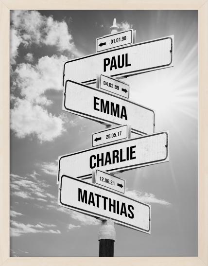
A street-sign layout is casual and readable, which makes it a strong fit for young families, playrooms, or spaces that need personality without formality. The Custom street sign family print is described as an original custom street sign with family member names, which is exactly the kind of format that works when you want names to feel playful and direct. If you've ever spent time comparing upholstery swatches and upholstery style decisions, understanding custom furniture upholstery is a useful parallel, because the best result comes from matching the visual language to the room, not just the sample.
A monogram-and-frame composition leans more formal. It works well in dining rooms, studies, or entry halls where you want polish. It can feel elegant, but it can also feel stiff if the home itself is relaxed or eclectic.
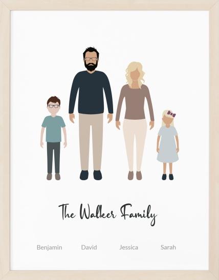
An illustrated family portrait gives you warmth and personality fast. It's a strong choice for gifts and for homes that already lean expressive. For people comparing multiple personalized formats, custom family portrait options tend to make sense when names alone don't carry enough meaning.
For buyers who want a broader home styling reference while they narrow down the visual direction, find stylish home decor online can be useful as a browsing aid, but don't let general decor inspiration override the actual room's needs.
Pick for longevity, not just trend appeal
Here's my blunt take. Typography-led pieces age best. Street-sign styles can stay charming, but they're more dependent on the rest of the room. Illustrated portraits have the most personality, which also means they're the easiest to outgrow if the family's style changes.
If you want one piece you won't want to replace quickly, choose a simpler composition with fewer novelty elements. If the print is meant to be a gift or a seasonal life moment, go ahead and be more expressive. The key is matching the style to how long you want to live with it.
Get the Size Right for the Wall You Actually Have
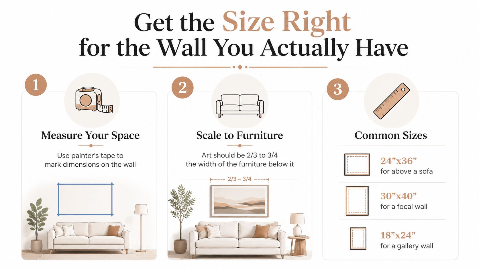
Sizing is where most buyers make expensive mistakes. They order what looks right in the listing image, then the print arrives and either floats awkwardly over the furniture or overwhelms the room. The fix is simple, use the wall you have, not the fantasy wall in your head.
Start with the two-thirds width rule
A useful starting point is the common 2/3rds rule for width. For pieces above a sofa or mantel, the art should generally sit within that visual band so it looks anchored instead of detached. The exact look depends on the furniture below it, but this rule keeps you from going too small.
Long surnames need more horizontal space than short ones. That sounds obvious, but buyers ignore it all the time, then wonder why the name looks squeezed. If your last name is long, choose a wider format before you start adding extra design elements.
Choose width for the name first, decoration second.
Match the room type to the shape
- Above a sofa. Go wider and calmer. The piece should span enough visual ground to balance the seating below it.
- Above a mantel. Keep the height controlled so the print doesn't fight the fireplace opening.
- In an entryway. Vertical proportions often work better because the wall is usually narrower.
- On a staircase wall. Angle and repetition matter, so a tall piece or a series usually reads better than one squat print.
For shoppers who want a quick sizing reference point, the poster sizing guide is worth keeping open while you measure. It's especially helpful if you're comparing a custom family name piece to something like a Personalized birth poster, because both need the same discipline, the wall decides the size, not the design page.
Small rooms need extra restraint. Lighter materials and thinner fonts keep the wall from feeling crowded. And for hanging height, keep primary pieces near eye level, then lower them slightly over furniture so the visual weight feels connected to the room instead of hovering above it.
Choose a Material That Fits the Room
Material changes the whole experience of the piece. A family name print on paper feels cleaner and more polished. Canvas feels softer and more relaxed. Wood or MDF feels substantial and decorative, but it needs better planning on the hanging side.
What each substrate does well
Museum-quality matte paper is the most controlled option. It suits formal living rooms, offices, and spaces where the print will be framed and protected. For a deeper look at the finish, see our guide on what is matte paper. Revellia notes that its posters are produced on museum-quality matte paper, which fits the kind of finish buyers expect when they want a refined wall piece rather than a craft project.
Canvas works better in rooms with more movement. Hallways, kid's rooms, and family spaces are where canvas usually makes sense, because it handles glare well and feels softer on the wall. Wood or MDF plaques bring presence, but they need the right hardware and a bit more care.
One practical issue from craft guidance is that finishing matters. Sanding, smoothing, letting paint dry fully, and using a protective sealant or clear coat help the surface look cleaner and hold up better. Another issue is assembly, a backing board that isn't cut precisely can create stapling or fitting headaches, especially when the layout is layered.
| Material | Look | Durability | Best Room |
|---|---|---|---|
| Matte paper | Crisp, refined, frame-friendly | Strong when framed and protected | Formal living room, office |
| Canvas | Soft, relaxed, low-glare | Good for everyday family spaces | Hallway, kids' room, den |
| Wood or MDF | Bold, tactile, substantial | Depends on finish and mounting | Entryway, mantel, feature wall |
Buy for traffic, light, and hardware, not just appearance
If the room gets a lot of touch, movement, or sunlight, choose a substrate that can handle it. If the wall is quiet and controlled, a framed paper print is often the smartest choice. If the piece needs to feel handmade and grounded, wood can be right, but only if the mounting plan is matched to the weight.
If you want to find stylish home decor online, use the same standard here. Look past the product photo and check how the material will behave in the actual room. A glossy finish can fight bright windows, a fragile edge can look rough near a busy hallway, and a heavy plaque can overwhelm a small wall.
That is the decision rule I use. Match the material to the room's traffic, its light, and how strong you want the piece to feel.
Decide What Personal Details Actually Belong on the Print
Personalization is where buyers overdo it. A family name should carry the piece. Everything else needs to earn its place. If a detail doesn't strengthen the story or the composition, leave it out.
Build the print around one main idea
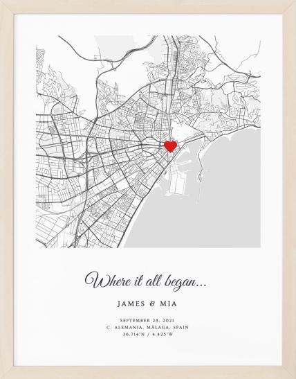
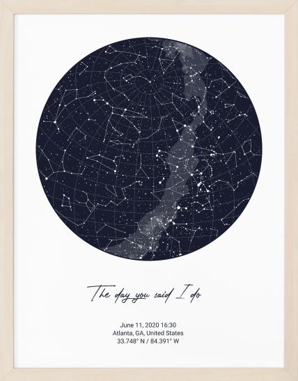
The safest core is the family name itself. After that, choose only one or two supporting details. An established date can add meaning without crowding the layout. A location or coordinates line can work, but only if the place matters enough to the family story. Icons, hearts, homes, florals, or stars should stay minimal unless the style is intentionally playful.
Long surnames take up more horizontal space, so the more text you add, the tighter the composition gets. That's why dual locations or multiple lines can make a clean print feel cramped. The same thing happens when every decorative idea gets included just because it's available in the editor.
Use this order of priority
- Family name. This is the anchor.
- Established year or date. Good if the piece marks a marriage, move, or family milestone.
- Location or coordinates. Useful when place matters more than ornament.
- One icon or motif. Helpful only if it reinforces the theme.
- Short quote or definition line. Best for gift pieces or more expressive styles.
Keep the composition readable at a glance. If it needs explanation, it's doing too much.
A clean format usually wins. If the name is long, I'd rather remove the extras than force the layout to carry everything. Decorative overload is the fastest way to make a custom family name wall art piece feel generic instead of personal.
For buyers considering a more illustrated route, the Original custom street sign with family member names is a good example of how names can stay central while the layout still feels lively. And if the whole point is a memory piece for a child, a birth poster-style layout can be the better fit, because that format is built around a different kind of information hierarchy.
Use the Online Editor Like a Proofing Pro
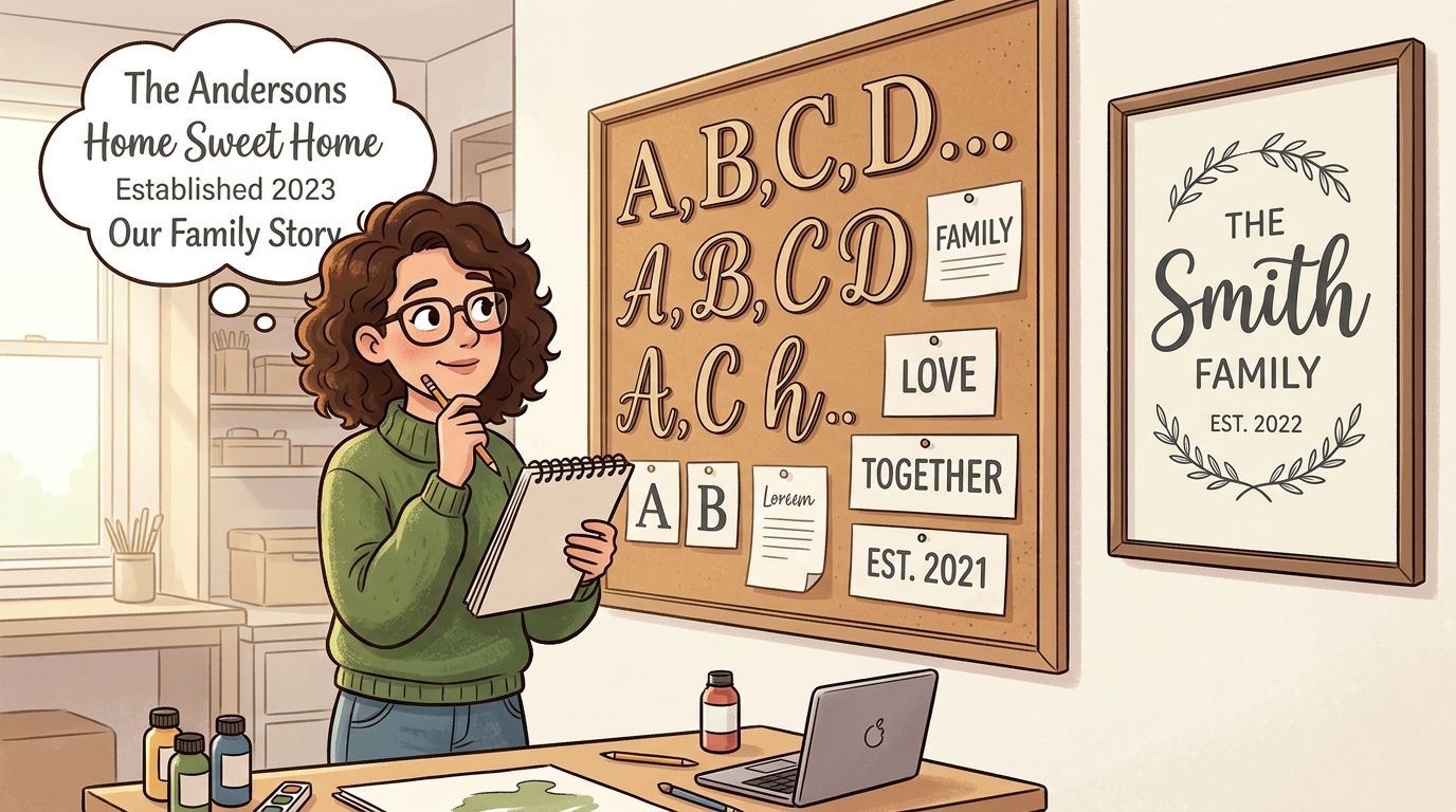
Most buyers treat the editor like a form. That's a mistake. The editor is where you catch the problems that cost time and reprints. A careful twenty-minute session is worth more than a rushed checkout.
Work the layout before you finalize the text
Open the base style first, then enter the family name exactly as it should appear. Swap fonts if the editor allows it, because the wrong font can make a long surname feel heavy or cramped. Adjust letter spacing and centering before you get attached to the preview, because default settings are rarely the best settings.
Use the live preview against the wall color or the frame color you plan to use. Screen previews can hide margin problems that show up only in print. That's why the safest workflow is a vector-first layout or a raster file exported at the final print size, followed by a 1:1 mockup check against the target frame or panel dimensions before export.
Run a short preflight before checkout
- Check the full composition. Don't judge one line at a time.
- Confirm safe margins. Make sure nothing is drifting too close to the edge.
- Verify aspect ratio. The print should match the substrate.
- Use high-resolution assets. High-resolution PDF or PNG files are the safer choice for print quality.
- Preview at final scale. If it looks crowded on screen, it'll look worse on the wall.
A lot of bad prints come from people uploading or arranging elements one at a time and never stepping back to inspect the whole piece. That's how you get off-center layouts, awkward spacing, and decorative elements that look fine individually but fail together.
You don't need to be a designer. You do need to inspect the composition like one.
Order, Unbox, and Hang It the Right Way
Once you place the order, the job isn't done. Good wall art can still look wrong if it's hung badly or cared for carelessly in the first week. That's especially true with personalized pieces, because the eye notices alignment mistakes immediately.
What to expect after checkout
Revellia's production model uses on-demand printing through a global network of local partners, and its site notes delivery windows typically within 3 to 7 business days. That kind of fulfillment timing matters for gifts and room refreshes, because a family name piece is often bought for a deadline, not just for decor. When the package arrives, open it carefully and inspect the print before you throw away any protective materials.
If you ordered a rolled print, plan to frame it yourself. If you chose a mounted or pre-framed format, check corners, edges, and hanging hardware right away. Minor damage is easier to address before the piece is on the wall.
Hang it level, then leave it alone
Use two people if the piece is large or awkward. One person holds, the other measures the spacing from furniture or neighboring frames. A simple level and painter's tape are enough for most homes, and felt pads behind frames protect the wall and help keep the piece steady.
A canvas should have time to acclimate to room humidity before it goes up, especially if it arrived tightly packed. Don't rush that step. If the room gets bright sun, keep the piece out of direct light whenever possible, because prolonged exposure can be rough on finishes and paper alike.
Treat it like the start of a wall, not the end
The best family name pieces tend to become the anchor for more decorating later. That's why buyers often choose them for weddings, new homes, anniversaries, or new baby gifts. They mark a moment without needing a lot of explanation.
If you want the next piece to feel as intentional as this one, keep the same discipline, measure first, edit less, and choose the substrate for the room instead of for the product photo. Visit Revellia if you want to design a custom family name wall art piece that matches the wall you have, not the one you wished you had.