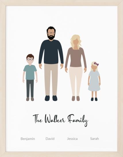
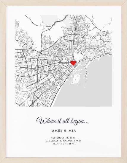
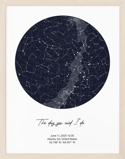
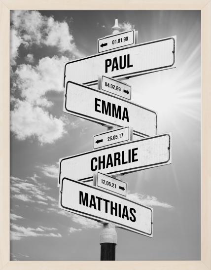

You've picked the artwork. Maybe it's a star map for an anniversary, a moon phases print for a date that changed everything, or a birth poster for a new nursery. The design feels personal, the colors look right, and then a size dropdown stops you cold.
That moment is more common than people admit. A poster can look perfect on screen and still feel too small, too dominant, too text-heavy, or oddly cropped once it reaches the wall. The good news is that poster sizing isn't a mysterious design skill. It's a mix of space, viewing distance, print clarity, and the feeling you want the piece to create in the room.
This poster sizing guide is built for that exact decision. It treats size as more than a number. It's the final choice that shapes how your story is seen, read, and felt.
Table of Contents
- Choosing a Poster Size Does Not Have to Be Hard
- Standard Poster Sizes and Common Uses
- Decoding the Tech Specs DPI and Aspect Ratio
- How to Choose a Poster Size for Your Room
- Designing for Scale with Revellia's Editor
- Poster Size Recommendations for Popular Gifts
- A Quick Guide to Framing and Matting
Choosing a Poster Size Does Not Have to Be Hard
You finish customizing a print and hit the last step. Then come the options. Small, medium, large. Inches, centimeters, maybe a few unfamiliar ratios. Suddenly a very heartfelt gift feels like a technical problem.
That hesitation makes sense. Size changes how a poster reads emotionally. A city map printed too small can lose its intimacy because street labels start to feel crowded. A birth poster printed too large for a nursery wall can overpower the room instead of adding warmth. The right size supports the memory inside the design.
A couple ordering anniversary art often wants two things at once. They want the piece to feel meaningful up close, and they want it to hold its own on the wall. Those goals can pull in different directions. Fine details often ask for enough space to breathe, while the room itself may call for restraint.
Practical rule: Don't ask “What size poster should I buy?” first. Ask “Where will this live, and how do I want it to feel when someone walks in?”
That's where most generic charts fall short. They tell you what's standard, but not what's suitable for a nursery, above a console, next to a bed, or inside a gallery wall. They also rarely talk about personalized art, where names, dates, coordinates, or tiny symbols behave differently from a simple abstract print.
A helpful poster sizing guide should make the choice calmer, not more complicated. When you connect size to room, detail, and mood, the numbers stop feeling random. They start feeling useful.
Standard Poster Sizes and Common Uses
Some poster sizes are popular because they fit the way people live. They work with common wall shapes, common furniture layouts, and common frame availability. That's why standard sizes are such a good place to begin.
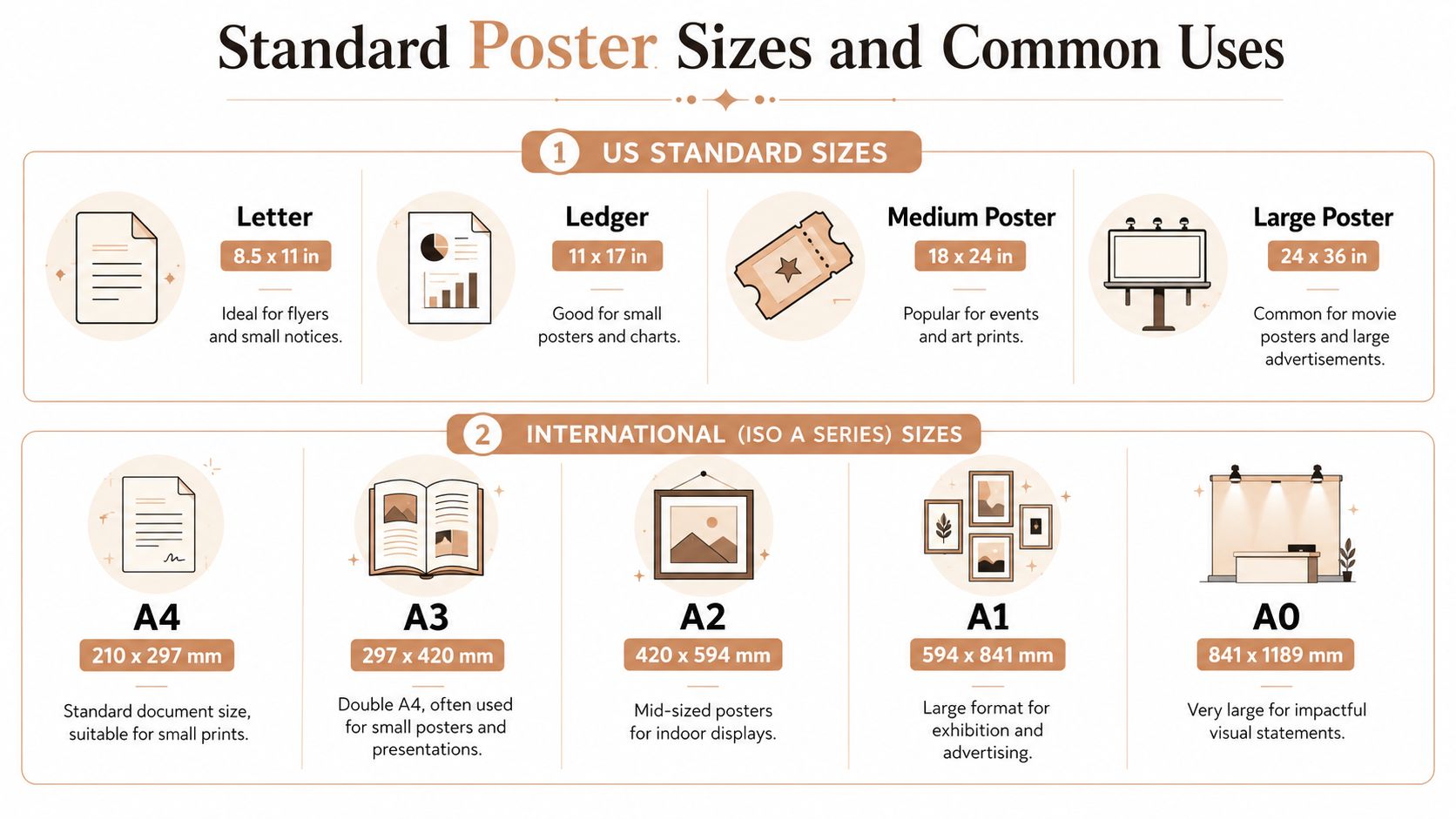
A quick size map
Here's a simple reference chart that combines common imperial and metric formats.
| Common Name | Imperial (inches) | Metric (cm) | Best For |
|---|---|---|---|
| Letter | 8.5 x 11 | 21.6 x 27.9 | Flyers, small notices, shelf displays |
| Ledger | 11 x 17 | 27.9 x 43.2 | Small posters, charts, desk-area art |
| Medium Poster | 18 x 24 | 45.7 x 61 | Bedrooms, apartments, event art, mid-sized wall decor |
| Large Poster | 24 x 36 | 61 x 91.4 | Living rooms, feature walls, retail displays |
| A4 | 8.3 x 11.7 | 21 x 29.7 | Small prints and document-style layouts |
| A3 | 11.7 x 16.5 | 29.7 x 42 | Compact posters, presentation use |
| A2 | 16.5 x 23.4 | 42 x 59.4 | Indoor mid-sized posters |
| A1 | 23.4 x 33.1 | 59.4 x 84.1 | Exhibition and large visual displays |
| A0 | 33.1 x 46.8 | 84.1 x 118.9 | Statement-scale visuals |
One size stands out more than the rest. The 18×24 inch poster is the most popular standard size globally in retail and home decor markets, accounting for 37% of all poster sales, according to this poster size reference from Haus of Prints. That popularity comes with practical advantages. It fits standard wall spaces in apartments and bedrooms, stays cost-effective for on-demand printing, and retailers commonly stock frames for it.
The same source notes that 18×24 inches is also widely used in the United States for retail window displays, point-of-purchase signage, and personal wall art, and that its dimensions align closely with A2. That makes it a useful bridge between North American and ISO-oriented formats.
Later in the section, this visual walkthrough can help if you want to compare layouts in motion.
What each size tends to do well
Small formats work best when the viewing experience is intimate. Think reading nooks, narrow hallways, desk corners, or a gallery wall where one piece plays a supporting role instead of carrying the whole composition.
Medium formats often create the easiest balance. They're large enough to feel intentional, but they don't crowd the wall. That's why something like a Personalized birth poster can sit comfortably in a nursery if you want the design to be visible without taking over the room. The catalog description is simple and factual: poster highlighting your childs birth information.
Large formats bring presence. They suit rooms where the print needs to read from farther away or where the wall would swallow a smaller piece.
A good size doesn't only “fit the wall.” It fits the role the artwork plays in the room.
If you're torn between two options, medium sizes usually offer the least friction. They're easier to frame, easier to place, and easier to live with if you rearrange furniture later.
Decoding the Tech Specs DPI and Aspect Ratio
A lot of sizing anxiety comes from two terms that sound more technical than they really are: DPI and aspect ratio. Once those are clear, poster decisions get much easier.
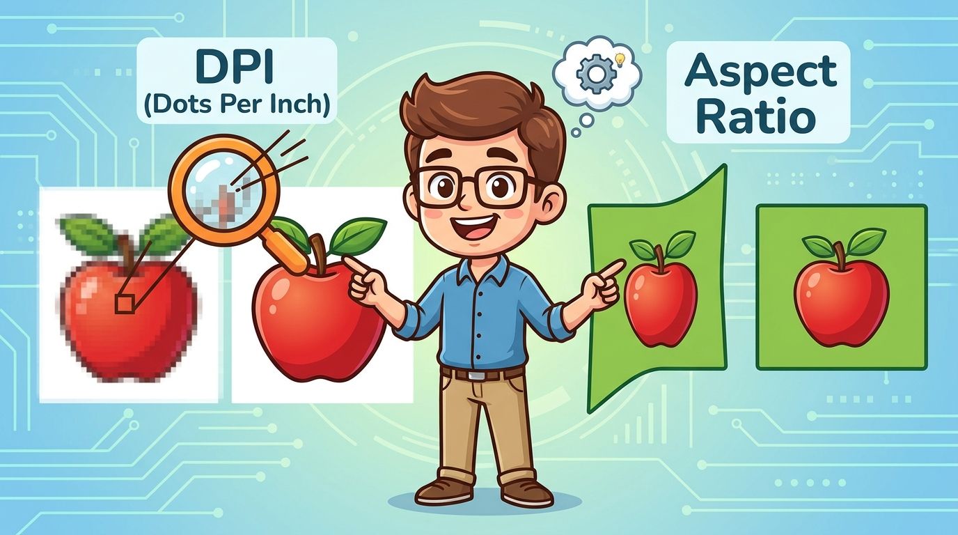
What DPI actually means
DPI means dots per inch. For everyday decision-making, it helps to think of it as print sharpness. Higher DPI means more visual detail packed into each inch of paper.
The key point isn't “higher is always better.” The key point is distance. According to Pixexact's poster size guide, posters 24×36 inches or smaller viewed up close need 300 DPI to preserve detail, while larger formats viewed from farther away can drop to 150–200 DPI without visible quality loss. The same guidance notes that 300 DPI matters especially for high-detail content such as small text or charts, while 150 DPI can work for large-format signage viewed beyond 6–8 feet.
That's why a bedroom print with names, dates, or map labels should be treated differently from a large decorative statement piece across a living room.
Here's the simplest way to use that in real life:
- Close viewing: Choose sharper files for prints people will stand near, especially in hallways, nurseries, and home offices.
- Detailed content: Prioritize high resolution when the design includes fine lines, typography, star coordinates, or chart-like elements.
- Far viewing: A larger poster across a room has more flexibility because the eye doesn't resolve tiny pixels the same way at distance.
If you're preparing your own artwork before uploading it anywhere, this guide to getting print-ready files offline is useful for checking dimensions and export settings before the final print step.
Why aspect ratio matters more than people expect
Aspect ratio is the shape of the poster. Not the absolute size, but the proportion. A tall narrow design and a wider rectangular design can both be “large,” but they won't crop the same way.
People often get surprised. They choose a larger size and assume the artwork will just expand evenly. But if the new size has a different ratio, something usually has to give. Edges may be cropped, white space may shift, or text may sit differently on the page.
A few practical reasons ratio matters:
- Framing gets easier: Standard ratios line up with commonly stocked frames.
- Layouts stay balanced: Text blocks, map labels, and illustration spacing feel more natural when the design was built for that shape.
- Your wall feels more intentional: The piece looks like it belongs, not like it was stretched to fit.
If a poster contains important information near the edges, ratio matters just as much as size.
When in doubt, keep the original shape of the design and scale within that family. That protects both readability and composition.
How to Choose a Poster Size for Your Room
A room gives you stronger clues than a product menu ever will. The wall, furniture, and sightlines already tell you what kind of poster size will feel right.
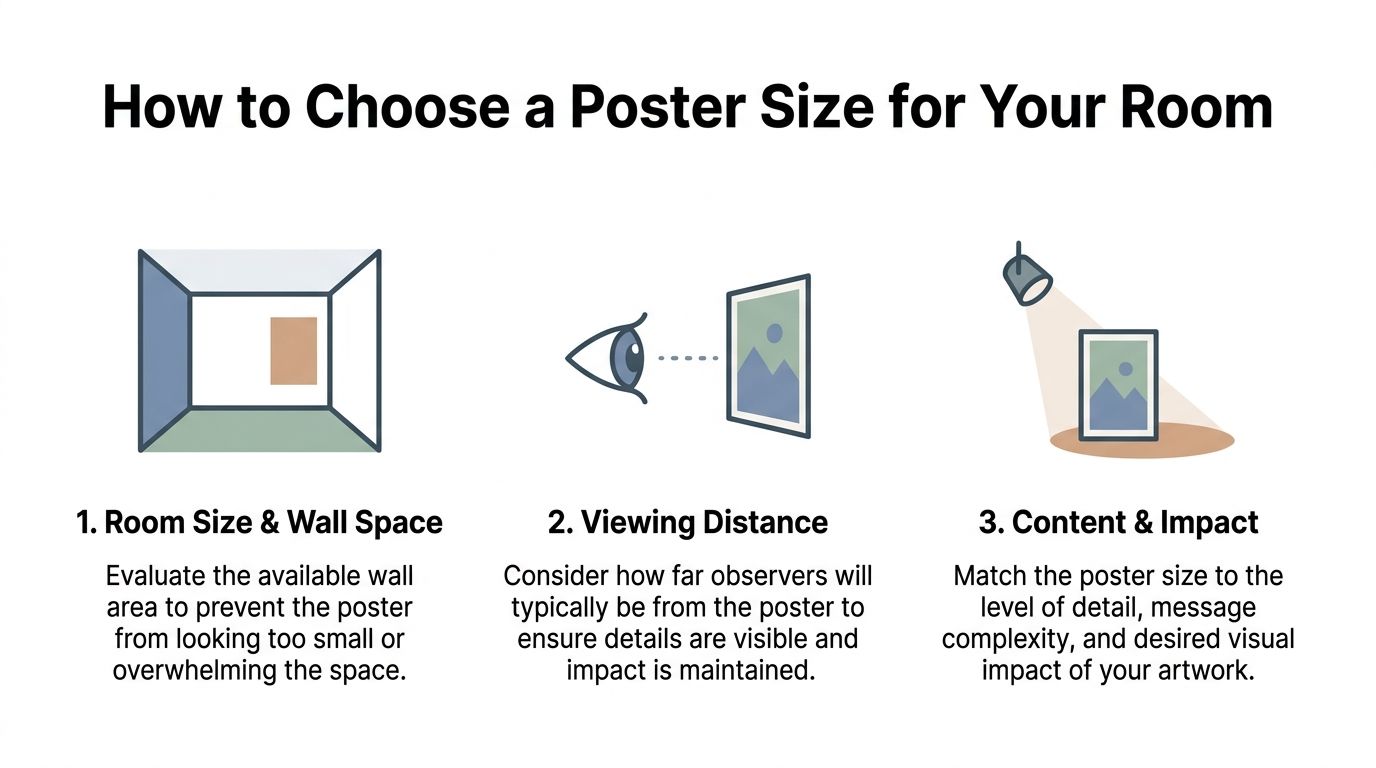
Start with the wall not the product menu
Begin by looking at the empty area around the future poster, not just the dimensions of the print itself. A piece above a bed behaves differently from one on a narrow hallway wall because the surrounding space changes how the eye reads scale.
Three checks help immediately:
Look at the open wall area
If the wall is wide and mostly uninterrupted, a very small poster can feel accidental. On a tighter wall section, an oversized print can feel cramped even if the dimensions technically fit.Notice nearby furniture
A poster above a sofa, console, crib, or dresser should relate to that object visually. You want a conversation between the furniture and the art, not a competition.Step back to your normal viewing spot
Don't judge the piece from inches away. Stand where you'd naturally experience it.
A room used for slow, close moments often supports more detailed personalized art. A hallway or open-plan living space usually needs a design that reads clearly from farther away.
Match the artwork to how the room is used
The content of the poster matters as much as the wall. A typographic definition print, a star map, and a movie-style layout all ask for different amounts of visual breathing room.
The 27×40 inch poster is a good example of a size with a very specific personality. It has been the standardized theatrical movie poster size in North America since approximately 1985, as explained in this overview from Frame Destination. That same reference notes that custom art producers can use 27×40 to recreate an authentic movie-poster look for personalized designs. If your goal is drama, nostalgia, or a cinematic focal point, this size carries that emotional language naturally.
Use that idea as a style cue:
- For a calm bedroom or nursery: medium formats usually feel softer and easier to live with.
- For a living room feature wall: larger formats can carry the space without looking timid.
- For a gift with “wow” energy: a movie-poster-inspired scale can feel theatrical and celebratory.
- For a gallery wall: let one medium piece lead, then support it with smaller companions rather than making every frame fight for attention.
The right poster size should feel settled in the room. Your eye shouldn't need to “forgive” it.
If you're between sizes, tape paper to the wall first. That simple mockup often resolves indecision faster than any chart.
Designing for Scale with Revellia's Editor
Generic poster advice usually assumes the artwork is generic too. Personalized art changes the equation because names, dates, coordinates, symbols, and tiny labels don't scale the way abstract shapes do.
Why personalized art needs extra care
A general size chart might tell you that a format works well for wall art. It usually won't tell you whether a custom star map still reads comfortably when reduced, or whether birth details stay visually balanced when the layout becomes more compact.
That gap has been noted directly in this poster size discussion from MerchFuse. It highlights a lack of guidance around how personalized data visualizations such as precise location maps, moon phase charts, and birth details scale differently from generic art. It also notes a practical risk: shrinking a star map to 18×24 may compress celestial coordinates beyond readability.
That's the core issue behind many disappointing prints. The size itself isn't wrong. The detail density is.
What to watch in a live preview
When you're customizing editor-based wall art, the preview deserves more attention than the size menu. Look closely at specific elements, not just the overall layout.
Focus on these details:
- Small text: Names, dates, birth stats, or labels should still feel relaxed, not packed.
- Fine lines: Map streets, constellations, and chart rings should stay clear rather than muddy.
- Negative space: Personalized art often looks better when it has room to breathe.
- Hierarchy: The most important part of the story should still stand out first.
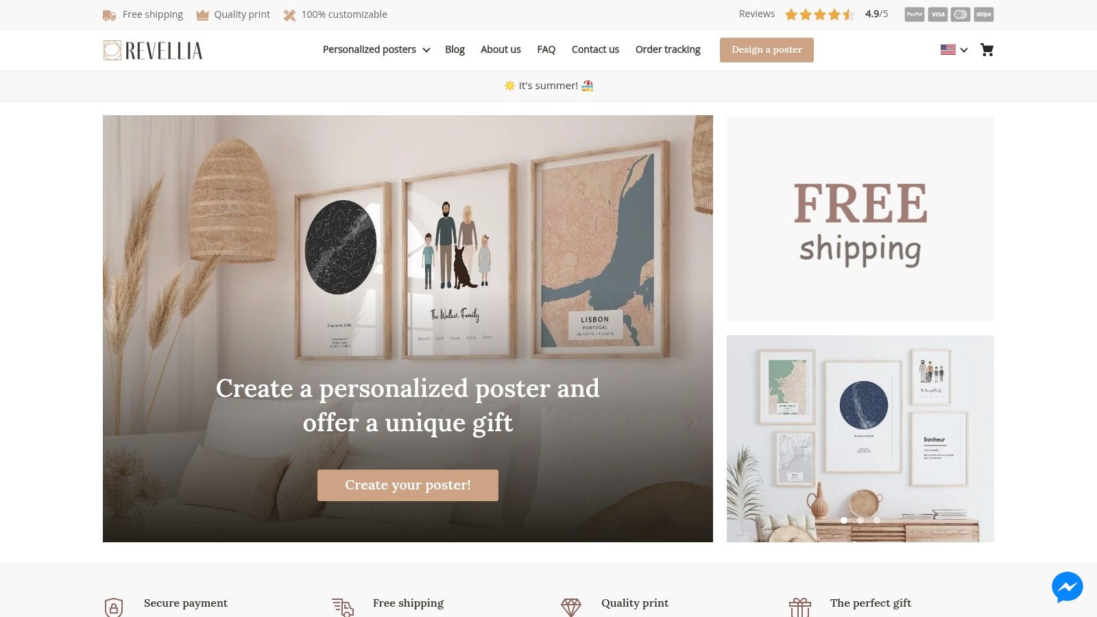
Revellia is one example of a browser-based editor for personalized posters and prints, with live previews and controls for text, date, and style. That kind of preview is useful because it lets you judge whether the story in the artwork still reads well at the chosen scale before anything goes to print.
Personalized posters aren't only images. They're information design with emotional weight.
That's why scale should be judged by readability and feeling together. If a smaller size makes the piece look crowded, the larger option may not be “more dramatic.” It may be more faithful to the story you're trying to preserve.
Poster Size Recommendations for Popular Gifts
Some poster decisions become easier when you stop thinking in abstract categories and start thinking about the gift moment. A nursery print doesn't need to behave like anniversary wall art. A home office map doesn't need the same presence as a cinematic statement piece.
Gifts that live in quieter rooms
A birth poster usually works best when it feels tender, not oversized. In many nurseries, a medium format gives the details enough room while keeping the wall soft and restful. If the design includes birth information, you want those details to be easy to read without making the room feel visually busy.
Anniversary gifts can go in two directions. For a bedroom, a more intimate size often feels appropriate because people experience it up close. A moon phases print tied to a meaningful date can feel almost diary-like at that scale.
If you're wrapping a print for gifting rather than sending it straight to the wall, sturdy materials help keep the presentation neat. This guide to wrapping paper is a practical reference if you want the outer presentation to feel as considered as the artwork itself.
Gifts meant to anchor a space
Some gifts are supposed to arrive with more presence. A custom map for a hallway, a family artwork above a console, or a dramatic commemorative print in a living room usually benefits from more visual weight.
A few grounded pairings tend to work well:
- Nursery keepsakes: Choose a medium size so the room stays calm and the information remains legible.
- Bedroom anniversary art: Lean smaller to medium for a more personal, close-viewing mood.
- Living room milestone prints: Go larger when the poster is meant to hold the wall on its own.
- Gallery wall gifts: Start with one anchor piece, then add supporting prints around it instead of sizing everything equally.
One useful test is emotional, not technical. Ask whether the size suits the memory. Some stories want to whisper. Others want to announce themselves from the doorway.
A Quick Guide to Framing and Matting
A poster's listed size isn't the final visual size once it's on the wall. The frame adds presence, and a mat can completely change the mood.
How mats change the mood
A mat gives the artwork breathing room. It can make a smaller print feel more refined and deliberate, especially when the design contains delicate details or sentimental text. In interior styling terms, a mat often slows the eye down. That can be a beautiful choice for personalized work.
A frame also changes the tone. Thin frames feel lighter and more contemporary. Heavier profiles add weight and formality.
A modest poster can feel far more substantial once you add matting and a frame with visual weight.
Why standard sizes make life easier
Standard poster sizes usually lead to less friction after printing. It's easier to find ready-made frames, easier to swap artwork later, and easier to plan wall placement with confidence.
Once the frame is ready, hanging matters too. If you want help with spacing and alignment, this guide can help you achieve precise picture hanging.
The last check is simple. Think of the framed piece, not just the printed sheet. That full footprint is what your wall will hold.
If you're ready to turn a meaningful date, place, or memory into wall art, Revellia lets you create personalized posters and prints in an online editor with live preview controls. That makes it easier to choose a size that fits both the room and the story you want the piece to tell.