You've stood in the living room, looked at the blank wall above the sofa, and felt that familiar stall. The art you like is fine. The room is fine. The problem is that the wall still doesn't feel finished, because the question isn't what looks nice, it's what layout fits this wall, this furniture, and this room's light.
That's why how to decorate a living room wall works better as a composition problem than a shopping problem. Once you treat the wall like a visual system, the options start to narrow in a useful way. Measure the furniture, choose one anchor, control the spacing, then let style follow the structure.
Table of Contents
- The Living Room Wall Decision Most People Skip
- Measure First, Hang Second
- Three Wall Layouts That Work in Almost Any Living Room
- Planning a Gallery Wall Without the Headache
- Hanging Hardware and Techniques That Actually Hold
- Making the Wall Meaningful With Personalized Prints
- Common Mistakes That Make a Decorated Wall Look Unfinished
The Living Room Wall Decision Most People Skip
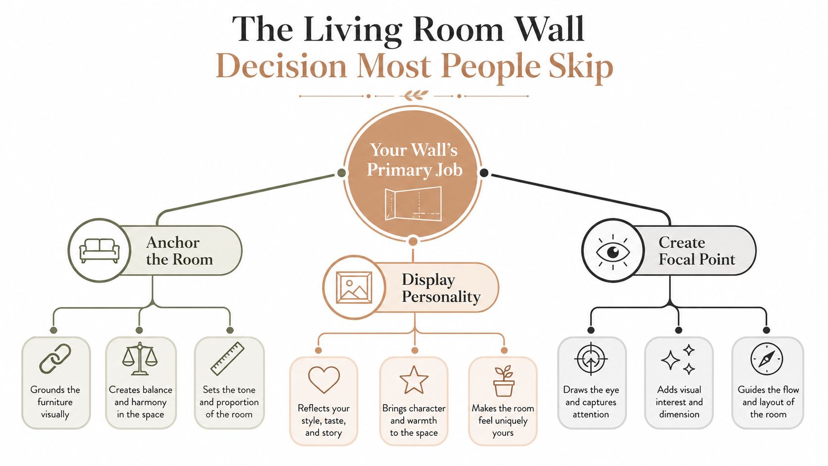
The wall is usually not the problem, the decision is. Many start by asking what art they like, then wonder why the result feels off once it's hanging over the sofa or console. A better starting point is to ask what the wall has to do, whether it needs to anchor the room, show personality, or create a focal point.
That shift matters because the market shows wall decor has become a major home category, not a small finishing touch. Global wall art spending was estimated at about $67–71 billion in 2026, with one forecast placing it at $70.94 billion in 2026 and projecting growth to $145.49 billion by 2034 at a 9.39% CAGR (wall art home decor statistics). That scale matches what I see in homes, people aren't decorating a wall as an afterthought anymore, they're using it to define the room.
Start with the room's job, not the object
A wall above a sofa needs different logic than a wall beside a doorway or above a low media unit. If there's furniture beneath it, the wall should relate to that furniture first. If it's a blank stretch with no anchor, the composition itself has to do the heavy lifting.
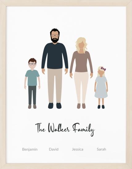
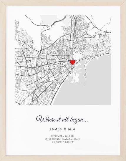
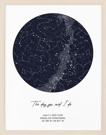
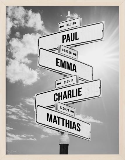
That's also why personalized pieces work so naturally here. A city map, star map, moon phase print, or family portrait can become the anchor because it already carries meaning, so you're not filling space with random frames. If you want a grounded country-style reference point, expert tips for upgrading country decor can help you see how simpler wall choices still need a clear visual structure.
Practical rule: if you can't name the wall's job in one sentence, don't buy art yet.
A good wall usually follows one of three paths, a single focal piece, a balanced grid, or a planned gallery wall. Each one solves a different version of the same problem, which is how to make the wall feel deliberate instead of patched together.
Measure First, Hang Second
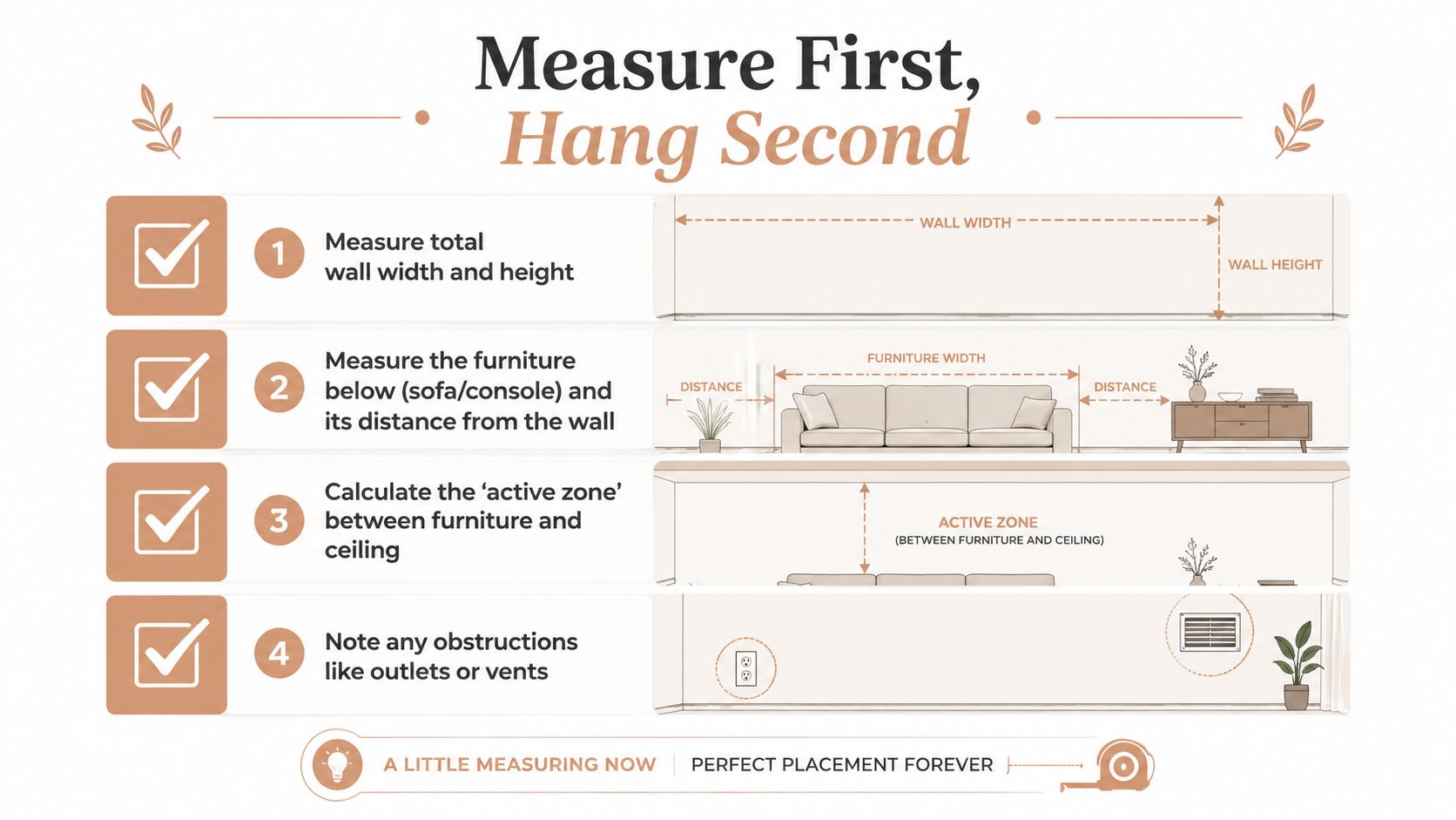
The quickest way to ruin a wall is to guess at size. I've watched people hold up a print, like the scale in the store, and then discover after hanging that it sits too high, looks undersized, or has no real connection to the sofa below it. Measure the wall width, the furniture width, and the usable vertical space between the furniture and the ceiling before you buy anything.
For a living room wall above furniture, the working range is straightforward. The art should take up about 60–75% of the width of the furniture below it, and the center usually sits around 57–60 inches from the floor (living-room wall decor ideas and expert tips). If the sofa is 100 inches wide, the art arrangement should be about 60–75 inches wide so it feels intentional instead of timid.
Use the furniture as the frame
Clearance matters too. A practical hanging range keeps a single piece 3–8 inches above furniture, and other hanging guidance places the bottom of the frame about 4–8 inches above the piece below it (how to hang art correctly, how high to hang pictures). That gap keeps the art tied to the sofa without crowding it or making the whole wall feel pinched.
A quick checklist keeps the decision honest:
- Measure the sofa or console width so the art does not end up too narrow.
- Mark the centerline of the furniture below it.
- Set the visual center at 57–60 inches from the floor.
- Leave 3–8 inches of space above the furniture so the composition can breathe.
- Watch for outlets, vents, switches, and sconces before you drill.
If you are choosing a custom piece like a Personalized where we met map, the wall already has a built-in focal point. The map carries the story, so the surrounding frames can stay quieter and more disciplined. If the print size is still unclear, the poster sizing guide gives a useful way to match format to wall width before you commit.
Do not hang based on the wall alone. Hang based on the wall and the furniture it has to live with.
A wall with accents, sconces, or a tall ceiling often needs a slightly different layout than a plain stretch above a sofa. If you are trying to work through a tricky corner or offset opening, find accent wall techniques for homeowners can help you think through the composition before you put holes in the wall. Once those measurements are set, choosing the right format gets much easier.
Three Wall Layouts That Work in Almost Any Living Room
When a wall feels hard, it's usually because it could support more than one good answer. In practice, three layouts solve most living room walls cleanly, a single focal piece, a symmetrical grid, or a gallery wall with a planned outer edge. The right one depends on the shape of the wall and the furniture underneath it.
A long wall above a large sofa usually wants one strong anchor. A shorter wall with low furniture often looks sharper with a grid. A tall wall with room to breathe can handle a gallery composition if the envelope is planned carefully.
Compare the three formats before you buy
| Layout | Best For | Width Rule | Spacing Rule |
|---|---|---|---|
| Single focal piece | Long sofa walls, simpler rooms, bold prints | About 60–75% of the furniture width | Keep 3–8 inches above the furniture |
| Symmetrical grid | Shorter walls, paired art, clean interiors | Treat the whole grid as one piece | Keep gaps uniform |
| Gallery wall | Tall walls, collected rooms, layered stories | Plan one outer envelope before hanging | Keep spacing even and the center balanced |
The best way to tell which direction fits is to look at the wall's shape. For a larger canvas, wall art ideas for a large wall can help you think in broad composition terms instead of individual frames. If you're working with an accent wall, find accent wall techniques for homeowners is useful because it reinforces the same principle, the wall needs a clear visual boundary.
What each layout does well
A single piece gives the room one clean focal point. It's the easiest way to keep a living room calm, especially when the furniture already has a lot going on.
A grid works when you want order without visual noise. Two or four frames, evenly spaced, can look more resolved than a larger, looser arrangement because the eye reads them as one unit.
A gallery wall handles personality and variety, but only when the outer shape is intentional. The wall should look composed, not like you ran out of space halfway through.
If you're torn between two formats, choose the one that matches the wall's longest axis.
Personalized art can fit any of the three. A star map works as a single anchor, a pair of city prints can become a grid, and family photos or illustrated portraits can sit inside a gallery wall without turning it into clutter.
Planning a Gallery Wall Without the Headache
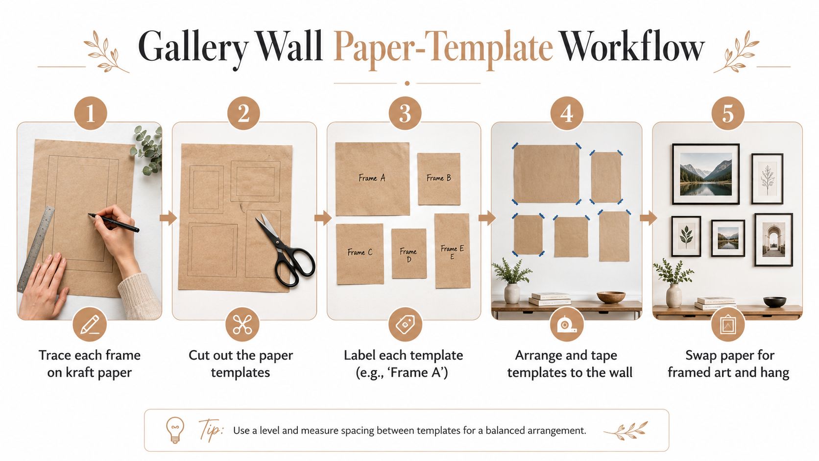
Gallery walls go wrong when the layout is decided by instinct and the nails go up too soon. Paper templates solve that problem because they let you test the composition at full scale without committing to holes. I've used this method on floors, on dining tables, and straight on the wall, and the wall test always reveals more than the version in your head.
Trace each frame onto kraft paper, cut the templates, label them, and tape them to the wall with painter's tape. Then view the arrangement from the sofa, from the doorway, and from the far side of the room. If one side feels heavy or a piece sits too high, move the paper before you pick up a hammer.
Keep the group behaving like one piece
The whole grouping should have one clear visual center, and the best test is how it reads from across the room. A gallery wall usually feels settled when the center sits around 60 inches on center. That does not mean every frame lands on the same line, it means the cluster reads as one anchored composition instead of separate objects competing for attention. Uniform spacing matters too, because uneven gaps make even good art look improvised.
When you mix sizes, one or two larger pieces can steady the arrangement better than a wall filled with small frames. An odd number of frames can work if the outer silhouette stays balanced. The point is to choose one dominant center and build around it, not spread everything evenly just because you have enough pieces.
Personalized prints fit naturally into that structure. A star map can hold the center, a pair of city maps can form a grid, and family portraits or illustrated faces can give a gallery wall a strong focal point without making it feel cluttered.
Here's a workflow that saves time:
- Lay everything on the floor first to test shape and order.
- Trace each piece on paper so the wall test matches the scale.
- Adjust the group on the wall until the outer edge feels calm.
- Mark the nail points through the paper once the spacing works.
- Hang the art and check it from across the room before tightening anything fully.
The video below is useful if you want to see the rhythm of a gallery wall in motion.
A personalized print can sit inside a gallery wall too, but it works best when it owns the center or one of the strongest positions. A memory piece should feel like the anchor, not just another rectangle in a crowd.
Hanging Hardware and Techniques That Actually Hold
The prettiest layout still fails if the frame shifts, tilts, or drops. Hardware choice should follow wall type and frame weight, not guesswork. Lightweight frames can live on picture hangers or small nails, but heavier pieces need anchors or studs, especially on drywall.
Drywall is the easiest case, but it still needs the right fastener. Plaster is less forgiving, so predrilling matters more and you want hardware that can support the load without cracking the surface. Masonry needs the right drill bit and anchor choice for the wall substrate, because a standard nail won't solve a brick or concrete problem.
Match the hardware to the wall, not the mood board
For renters, adhesive strips can be useful on lighter pieces, but they're not the answer for everything. Use them where removal matters more than load, and don't rely on them for oversized frames that need real support. Heavier pieces deserve a stud or a properly rated anchor.
A small two-point hanging trick helps a lot. If a frame has two hanging points, mark both, measure carefully, and use a level so the wire or hooks don't leave the piece crooked. A smartphone level is fine, and a tape measure plus pencil marks is still better than eyeballing it while standing on a chair.
A frame that looks perfectly centered but wobbles by a few degrees will always read as unfinished.
For a clean install, keep this order: mark the centerline, find the anchor points, confirm the height, then hang and check again from a few steps back. If the room has a sloped ceiling or an awkward upper wall, keep the art aligned to one consistent horizontal reference rather than chasing the slope with each piece.
A mounted piece should look like it belongs to the wall, not like the wall is holding it up by accident.
Making the Wall Meaningful With Personalized Prints
A couple celebrating a first anniversary does not need another generic set of botanicals. They need one piece that holds the memory, then a layout that gives it room to read clearly. Personalized art earns its place because the wall can be built around the memory instead of forcing the memory into a trend.
A star map from the night they met, a city map of the place where they got engaged, a moon phases print tied to a birth date, or a custom family portrait can serve as the anchor piece in almost any layout. On a long wall, the print can stand alone as the focal point. In a room that needs order, it can sit at the center of a grid. In a gallery wall, it can be the piece that gives the whole arrangement emotional weight and keeps it from feeling decorative for decoration's sake.
Build the room around one meaningful object
A memory piece looks cleaner when the rest of the room supports it instead of competing with it. Pull one or two colors from the print into pillows, a throw, or a lamp shade, then let the surrounding pieces stay quieter so the artwork remains the visual anchor.
A personalized star map works especially well in a living room because the graphic shape is strong enough to hold a wall without extra clutter around it. It does not need a stack of unrelated frames to feel important. A pair of sconces or a floor lamp can add a second layer of light, which helps the print stay visible instead of flattening into the wall.
The strongest results usually follow a simple sequence:
- Choose one memory that matters instead of trying to tell the whole story at once.
- Match the format to the wall shape so the print fits the room instead of fighting it.
- Repeat one color in textiles or lighting to tie the wall back into the seating area.
- Keep nearby frames simple so the personalized piece keeps its voice.
I have seen this work especially well when someone wants the living room to feel personal without turning it into a scrapbook. One strong print is enough if the layout is disciplined and the surrounding objects are quiet.
Common Mistakes That Make a Decorated Wall Look Unfinished
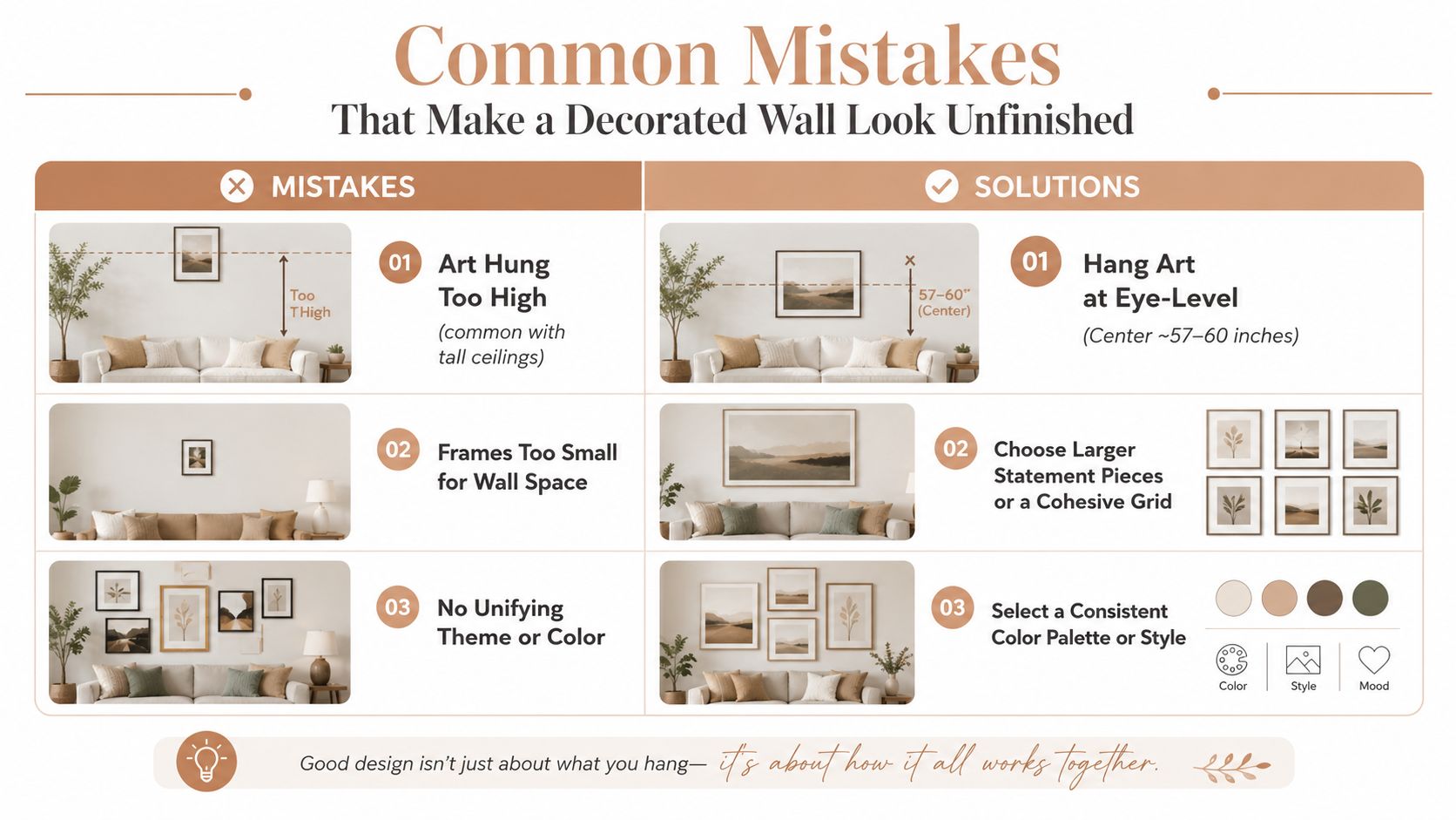
Most unfinished walls fail for the same few reasons, and nearly all of them are fixable tonight. The biggest one is height. People hang art too high, especially in homes with taller ceilings, and the piece stops connecting to the furniture below it.
The second problem is scale. Small art on a large wall reads as timid, even when the art itself is beautiful. If the wall is broad, the piece has to claim more of it, either with one larger work or a tighter grouping that reads as one unit.
Fix the wall in the order it broke
- Art hung too high, lower the center so it lands near 57–60 inches from the floor.
- Frames too small for the wall, choose a larger statement piece or treat several frames as one planned grouping.
- No unifying theme or color, repeat a consistent palette, frame finish, or image type.
- Ignoring the furniture axis, center the art over the sofa or console instead of the wall's empty center.
- Overcrowding, remove one or two items so the wall can breathe.
- Flat overhead lighting, add at least one more light source at a different height so the art doesn't flatten out.
- Skipping the paper template, mock it up first so the wall can be adjusted before any holes go in.
A slanted wall creates its own version of the same issue. Keep one anchor line, keep the negative space consistent, and don't let every frame follow a different angle just because the ceiling slopes. The composition should feel stable, not like it's sliding downhill.
Too many frame finishes can also break the room apart. Unless the mix is intentional, it usually helps to keep the frames similar enough that the art, not the hardware, carries the attention. Less but planned almost always looks better than more but scattered.
If you're ready to stop guessing and build a wall that feels finished, start with one measurement, one anchor piece, and one clear layout. Browse Revellia for a personalized print that matches the moment you want to remember, then hang it with the same care you'd give any focal point in the room.