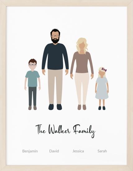
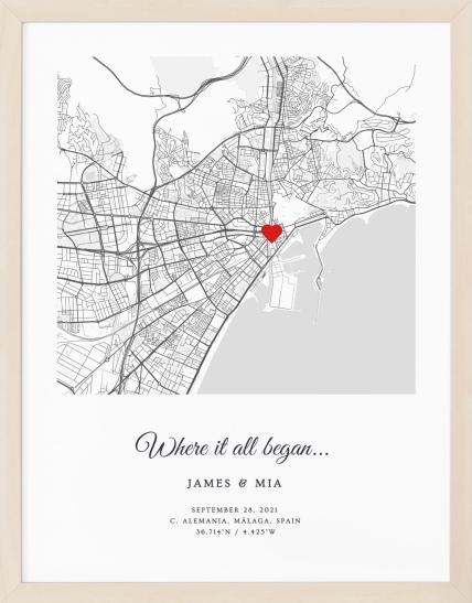
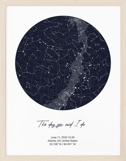

Matte paper is a non-reflective, textured print finish that works especially well for art prints in bright rooms, and museum-quality matte paper is often around 230 gsm with archival standards designed for long-term permanence. Unlike shiny photo paper, it doesn't bounce light back at you, so the image stays easy to see instead of turning into a mirror.
If you're choosing a print for a family portrait, a star map, or a custom location poster, this is usually the moment where paper suddenly feels more important than expected. The design may already be perfect on your screen, but the paper decides how that memory will live on your wall, how it feels in your hands, and whether you notice the artwork or the glare first.
A lot of people know what glossy paper looks like. Fewer people can explain what matte paper is. That gap matters, because paper finish isn't a small technical footnote. It changes color mood, readability, touch, and how practical the print is for everyday life.
Table of Contents
- What Is Matte Paper and Why Does It Matter for Your Prints?
- The Anatomy of Matte Paper Explained
- Matte vs Gloss vs Satin A Visual Showdown
- The Top Advantages of Choosing a Matte Finish
- Archival Quality and Environmental Responsibility
- How to Choose Frame and Care for Your Matte Prints
- The Understated Elegance of a Matte Finish
What Is Matte Paper and Why Does It Matter for Your Prints?
If you've ever ordered a print and then felt unsure at the final paper selection step, you're not alone. The finish sounds like a minor detail, but it shapes the entire viewing experience.
Matte paper is a coated paper stock with a soft, non-glossy finish. That means it isn't the same as plain uncoated paper, and it isn't the same as glossy photo paper either. Matte paper uses a light surface sealant that changes how ink sits on the sheet and how light interacts with the surface, which is why it looks calm and glare-free rather than shiny and punchy, as explained by Formax Printing's overview of matte versus uncoated paper.
Why people notice the difference right away
The easiest way to think about matte paper is this. Glossy paper tries to catch your eye with shine. Matte paper tries to keep your attention on the image itself.
That matters for artwork with meaning attached to it. A family portrait should still look lovely when relatives pick it up. A star map should stay readable in a living room with overhead lights. A map poster should feel refined instead of flashy.
Practical rule: If a print will hang in a well-lit room, be handled often, or contain a lot of text or fine detail, matte is often the more comfortable finish to live with.
Why the paper choice matters before you print
Paper can't rescue a weak file, but it can reveal the strengths of a good one. If you're preparing artwork and want to ensure flawless prints for creators, it helps to think about image quality and paper finish together instead of treating them as separate decisions.
A strong print isn't only about resolution. It's also about whether the surface supports the mood you want. Matte paper tends to suit keepsake art because it feels quieter, more tactile, and easier to display in everyday spaces.
The Anatomy of Matte Paper Explained
A matte print can look quiet on the wall and still be highly engineered on the page. Its calm appearance comes from how the sheet is built, how the surface holds ink, and how it handles light in an everyday room.
The coating is the key
Matte paper is usually a coated stock with a restrained surface layer that helps control where the ink sits. Instead of bouncing light back like a glossy sheet, that surface diffuses it. The print looks softer, calmer, and easier to live with in normal lighting.
A simple comparison helps:
- Uncoated paper works like a sheet that drinks in more ink.
- Glossy paper works like a polished surface that throws light back at you.
- Matte paper works like a painted gallery wall. It keeps reflections low so your attention stays on the artwork.
That balance gives matte its personality. It feels more refined than plain office paper, but less slick and attention-seeking than gloss.
Why matte looks soft instead of shiny
Shine and quality are not the same thing.
Matte paper is designed to scatter light across the surface, which reduces the glare that can hide detail. In practice, that changes how a print feels in the home. A family portrait stays visible when someone tilts it under a lamp. A custom star map remains readable in a bright living room. An art print above a sofa feels settled rather than flashy.
The effect is emotional as much as technical. Skin tones often appear gentler. Illustrations can feel more natural and textured. Text and fine lines are easier on the eyes because the paper is not fighting for attention.
Matte paper lets the image set the mood. The surface stays in the background.
Texture, weight, and whiteness in plain language
These are the terms that often sound technical until you hold two prints side by side.
Texture
Matte paper often has a soft, almost velvety touch. Some sheets are very smooth, while others have a slight tooth, which means a faint surface grain. That touch matters for gift prints and keepsake art because people do not only look at them. They pick them up, frame them, and pass them around.
Weight
Weight affects how substantial a print feels in your hands. A heavier matte sheet usually feels more stable, more gift-worthy, and less like a disposable poster. If you are printing a wedding portrait or a personalized quote for framing, that extra body changes the whole impression before the image is even studied.
Whiteness
Whiteness is the color of the paper base, not the shine of the finish. A brighter white sheet can make dark lines look cleaner and colors appear more crisp, while a warmer white can make artwork feel softer and more classic. Koala Paper's fine art matte paper article explains how paper base tone shapes the final presentation.
Put those three traits together, and matte paper starts to make sense. Texture influences touch. Weight influences presence. Whiteness influences the mood of the image. That is why two matte prints can both be "matte" and still feel very different once they are framed and hanging in a real room.
Matte vs Gloss vs Satin A Visual Showdown
A theory lesson isn't what's primarily sought. Practical understanding of which finish suits the print in front of them is.
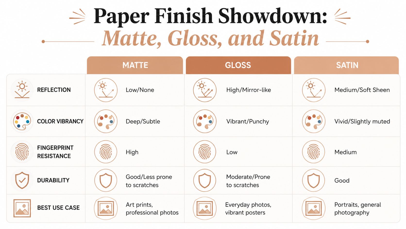
Here's the practical comparison:
| Finish | Surface look | Color feel | Fingerprints | Best fit |
|---|---|---|---|---|
| Matte | Flat, non-reflective | Soft, subtle, restrained | Resists fingerprints well | Art prints, text-heavy designs, bright rooms |
| Gloss | Shiny, reflective | Punchy, high-contrast | Shows fingerprints easily | Small photo prints, bold image impact |
| Satin | Soft sheen | Between matte and gloss | Moderate | General photo display, portraits |
What changes most when you switch finishes
The biggest trade-off is usually reflection versus punch.
Glossy paper tends to look brighter and more dramatic at first glance, especially in strong colors. Matte paper gives up some of that shine-driven intensity in exchange for comfort, readability, and a more understated look. Satin sits in the middle, offering some sheen without the full mirror effect of gloss.
That sounds abstract until you hang the print on a wall. If the room has daylight, lamps, or overhead lighting, gloss can start reflecting the room back at you. Matte doesn't do that in the same way, so the artwork stays easier to see from different angles.
What about detailed designs like maps and star charts
People often hesitate. If matte gives softer color, will delicate details disappear?
For many meaningful designs, the softer rendering is part of the appeal. Mixam's discussion of matte versus glossy paper notes that matte finishes absorb more light, causing colors to appear "softer and less intense" than gloss's "shiny, high-contrast appearance." The same source also highlights that this "subtle, muted look" can create an authentic, non-distracting experience for data-driven art such as celestial charts.
That matters for wall decor. A star map isn't trying to look like a nightclub flyer. It usually looks better when dark gradients, labels, and fine points can be viewed without glare. The same logic applies to a Personalized where we met map, which is a personalized map of the place where you first met. If that print includes streets, labels, and sentimental text, matte often suits the purpose better than a reflective finish.
A quick decision guide
- Choose matte if the print will be framed in a bright room, include text, or aim for a gallery-style look.
- Choose gloss if your top priority is visual punch in a smaller photo print and reflections won't bother you.
- Choose satin if you want a middle-ground finish with some vibrancy and less glare than gloss.
If you're decorating a living space rather than filling a photo album, matte usually feels easier to live with day after day.
The Top Advantages of Choosing a Matte Finish
Matte paper earns its place through everyday usefulness. The benefits show up not only in a studio or gallery, but in real homes with windows, fingerprints, and busy routines.

It stays readable in bright rooms
A print opposite a window can become frustrating fast if the surface reflects everything around it. Matte paper reduces glare, so the artwork remains visible without forcing you to change where you stand.
That makes a big difference for home decor. A custom moon phase print in a hallway, a family portrait near a lamp, or a location map in a sunlit kitchen all benefit from a finish that doesn't fight the room.
It handles touch better
Some prints are meant to be admired from a distance. Others get picked up, passed around, or adjusted often. Matte paper has a practical edge here.
Printing Partners' explanation of matte paper notes that matte paper is fingerprint-resistant and smudge-free, and that its non-reflective surface works well in bright rooms. The same source also describes matte finish paper as the thickest sheet by basis weight among coated paper types, which supports applications where stiffness matters.
For a keepsake piece, that means less stress. If grandparents hold a portrait print, or you move an unframed poster while decorating, you're less likely to end up staring at oily marks on the surface.
It works as a more tactile, human finish
Glossy paper often feels sleek. Matte paper feels more like an object made to keep.
That tactile quality matters for personalized gifts. When someone opens a print tied to a wedding date, a birthplace, or a shared memory, the feel of the paper influences the emotional impression. Matte's softer surface tends to feel warmer and more intimate.
A short visual explanation helps if you want to see the finish in context:
It gives artwork a polished but quiet presence
Matte doesn't shout. That's part of its charm.
- For portraits: skin tones and expressions often feel calmer and less clinical.
- For text-led prints: names, dates, coordinates, and captions stay easy to read.
- For modern interiors: the finish blends naturally with wood, linen, plaster, and softer decor palettes.
A useful test: Ask whether you want people to notice the paper first or the memory first. Matte usually keeps the focus on the memory.
Archival Quality and Environmental Responsibility
A custom print often begins as a gift idea. Years later, it becomes part of the room, part of the routine, and sometimes part of family memory. That is why paper quality matters here in a very human way. A wedding portrait on a nursery wall or a star map above a sofa should still look cared for after years of light, handling, and seasonal changes in the home.
What archival really means
Archival matte paper is made to age more gracefully than ordinary paper. The goal is simple. Slow down the kind of chemical change that causes yellowing, brittleness, and a tired-looking surface.
A few terms can make this sound more intimidating than it is:
- Acid-free paper starts with a cleaner chemical balance, so the sheet is less likely to break down from within.
- Alkaline reserve works like a small protective buffer. It helps the paper cope with acidic exposure over time.
- ISO 9706 refers to a permanence standard for papers intended for long-term keeping.
If you are choosing a print for a birth, anniversary, or memorial piece, those details affect more than storage life. They affect whether the print still feels worthy of the memory years from now.
Why material quality changes the experience
Longevity is partly chemistry and partly construction.
A heavier matte sheet usually feels steadier in the hand and sits with more confidence once framed. Papers made from cotton or high-grade pulp are also common in archival printing because they hold detail well and tend to remain stable over time.
The easiest comparison is a keepsake book versus a disposable leaflet. Both can carry the same image, but they do not send the same message about what deserves to be kept.
The environmental side of paper choice
Environmental responsibility has two parts here. One is the paper itself. The other is how the print is produced and delivered.
Many archival art papers are available with FSC certification, which indicates wood fiber sourced from responsibly managed forests. That does not answer every sustainability question, but it is a meaningful starting point if you want the materials behind a personalized gift to reflect the care shown in the design.
Production method matters too. Revellia produces personalized posters on museum-quality matte paper and uses an on-demand network of local print partners in multiple countries. The practical benefit is easy to understand. Printing closer to the customer can reduce transport distance, and printing to order can reduce the waste that comes from large pre-printed inventories.
What this means for a gift or heirloom print
For a family portrait, archival matte paper helps the print stay presentable through years of viewing. For a personalized night sky print in a living room, it supports a finish that looks calm today and remains worth hanging onto later.
That combination of durability and thoughtful sourcing is part of matte paper's appeal. It does not just protect an image. It helps protect the meaning attached to it.
How to Choose Frame and Care for Your Matte Prints
A matte print is forgiving, but it still benefits from thoughtful handling. A few small choices make a real difference in how it looks over time.
Framing choices that make sense
You can frame matte prints with or without glazing, depending on the look you want.
- With glass or acrylic: You gain protection from dust, touch, and general household wear. This can be useful for hallways, children's rooms, or high-traffic spaces.
- Without glazing: You preserve the direct, tactile character of the matte surface. Many people like this for a more gallery-style presentation.
The one point worth keeping in mind is lighting. Matte paper already helps reduce glare, so even when you add glazing, the print often remains easier to view than a glossy print under the same conditions.
Simple care habits
Matte paper doesn't need complicated maintenance.
- Handle by the edges: This reduces transfer from skin oils.
- Dust gently: Use a soft, dry cloth rather than rubbing aggressively.
- Avoid liquid cleaners: Household sprays and chemical cleaners can damage print surfaces and framing materials.
- Keep placement sensible: Direct sun over time is rarely ideal for any artwork, even when the paper is chosen for long-term quality.
Choosing a print source
If you don't want to compare paper specs yourself, it helps to order from a seller that clearly states the finish and material. Revellia is one example. It lets customers create personalized posters in an online editor, then prints them on museum-quality matte paper for formats such as maps, celestial charts, and illustrated portraits.
For baby gifts and nursery walls, a Personalized birth poster can be a good example of where matte makes sense. It's a poster highlighting your childs birth information, so clarity, softness, and a non-shiny finish often fit the purpose better than a glossy photo look.
The Understated Elegance of a Matte Finish
So, what is matte paper as the question is typically intended?
It's the paper finish you choose when you want the artwork to feel calm, tactile, and easy to live with. It softens reflections, handles everyday display more gracefully, and gives meaningful prints a more collected, lasting presence.

For a family portrait, that means fewer distractions from glare. For a star map, it means the sky stays viewable in a real room instead of only in perfect lighting. For a personalized gift, it means the print feels less like a quick photo output and more like something made to keep.
Matte paper doesn't try to impress with shine. It earns its place through restraint. That's why it remains such a strong choice for custom wall art, especially when the print is tied to memory, identity, or home.
If you're ready to turn a meaningful date, place, or story into wall art, Revellia lets you design personalized posters in an online editor and have them produced on museum-quality matte paper.