You've probably had this moment already. There's an empty stretch of wall, a frame size in mind, and a strong sense that you don't want another generic celestial print that looks good for a week and then starts feeling interchangeable. Crescent moon art solves that problem when it's handled well. It carries history, mood, and symbolism, but it can also mark a personal date in a way that feels intimate rather than decorative.
That's where most moon posters go wrong. The shape is often oversimplified, the tilt is guessed, and the final piece ends up being “moon themed” instead of meaningfully tied to a real sky. If you're collecting visual references before designing, it can also help to view this new beginnings amethyst as an example of how crescent forms translate across art objects and decor without losing their symbolic pull.
Table of Contents
- Introduction to Crescent Moon Art
- Inspiring Styles and Color Palettes for Crescent Moon Art
- Composition and Accurate Moon Orientation
- Designing Crescent Moon Art in the Online Editor
- Choosing Print Materials and Poster Sizes
- Framing and Display Ideas
- Conclusion and Gifting Ideas
Introduction to Crescent Moon Art
Crescent moon art lasts because the symbol itself lasts. Archaeological evidence shows the crescent moon symbol has been used in global art for over 5,000 years, appearing first around 3000 BCE in Mesopotamian iconography, which gives even a very modern poster a sense of continuity with older visual traditions, as noted in the history of the star and crescent symbol.
For poster design, that long history matters less as trivia and more as a practical advantage. A crescent can sit in a minimalist room, a nursery, a meditation corner, or a darker gallery wall and still feel appropriate. Few motifs do that without becoming bland.
Accuracy is the key difference. A generic crescent works as decor. A crescent matched to a date, location, and phase works as a keepsake. That's why the decisions that seem small at first, such as arc thickness, tilt, color temperature, and empty space around the moon, end up carrying most of the emotional weight.
A personalized moon print only feels personal when the viewer can trust the sky it shows.
Inspiring Styles and Color Palettes for Crescent Moon Art
Some crescent moon art leans symbolic. Some leans atmospheric. Some is really about line discipline more than lunar imagery. The strongest posters choose one visual language and stick to it.
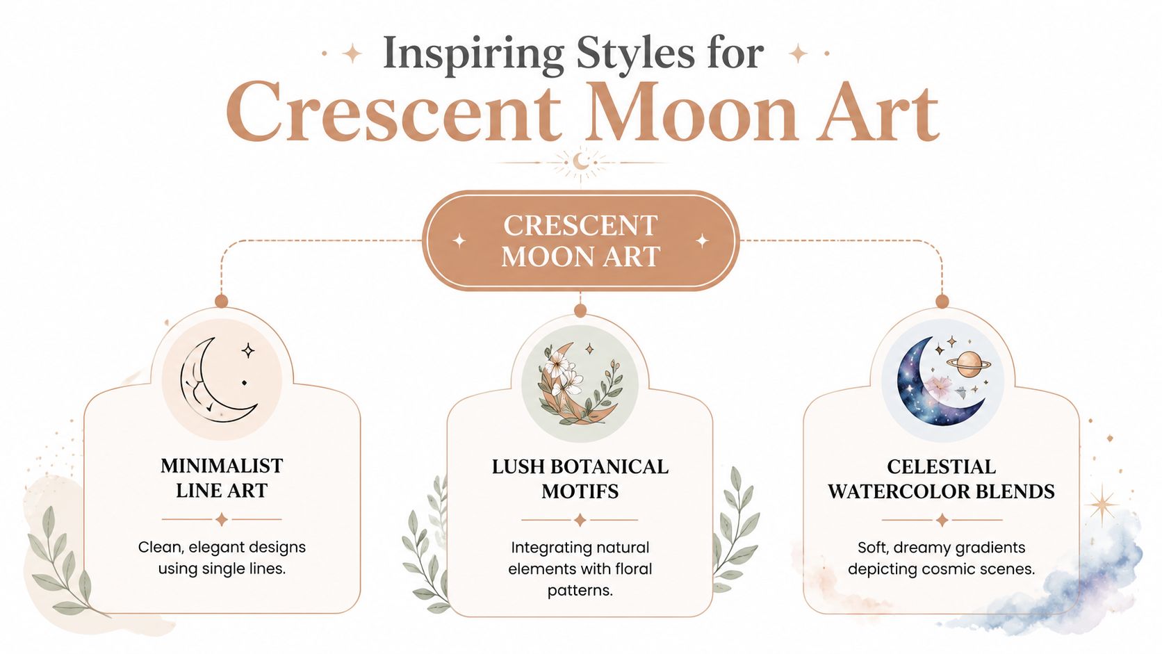
Minimalist Line Art
This style depends on restraint. Thin or medium-weight strokes, generous negative space, and almost no secondary decoration. It works when you want the crescent to read as an object with intent, not just a filler graphic.
Two palette directions work especially well:
- Soft Scandinavian neutrals. Warm white, sand, muted taupe, charcoal.
- High-contrast monochrome. Black, ivory, and one quiet metallic accent if the print process supports it.
The risk is sterility. If the line is too thin for the final print size, the crescent can disappear at a distance. If the line is too heavy, the piece stops feeling elegant and starts reading like iconography.
Lush Botanical Motifs
The crescent serves as a structural frame. Vines, pressed-flower shapes, leaves, or trailing stems can wrap around the arc or fill the interior negative space. It's a strong fit for wedding gifts, nurseries, and softer interiors.
Use palettes that keep the plant forms readable:
| Style direction | Good palette pair |
|---|---|
| Botanical romance | Sage, dusty rose, cream, muted gold |
| Earthier botanical | Olive, clay, parchment, deep brown |
This approach tends to fail when every floral element gets equal detail. The eye needs hierarchy. Usually the crescent should remain the cleanest shape on the poster, with plants acting as rhythm around it.
Celestial Watercolor Blends
This style handles atmosphere better than precision. Soft gradients, clouded edges, scattered stars, and layered blues or violets create a dreamy print that feels less graphic and more painterly. The crescent moon's modern decorative role often draws on that emotional register. While the crescent moon is known globally as an Islamic emblem from the 13th century, today it also evokes creativity and mystery in Western decorative design, discussed in this cultural overview of the crescent moon and star.
Practical rule: If your background has visible texture or watercolor bloom, simplify the crescent edge. If both are soft, the poster loses focus.
For color planning, I often test combinations before drawing details. If you need a quick palette sandbox, find color inspiration with a generator and then trim the result down to three or four usable tones. That produces better poster discipline than trying to use every attractive color at once.
A good reference point for personalized formatting is a Personalized moon phases poster, which is a moon phase poster for a memorable date. What matters in pieces like that isn't visual complexity. It's whether the style supports the meaning instead of distracting from it.
Composition and Accurate Moon Orientation
A moon poster can feel wrong, even if the reason isn't immediately clear. Usually it's the tilt. The crescent is facing the wrong way, or it has the right phase but the wrong orientation for how the sky would appear.
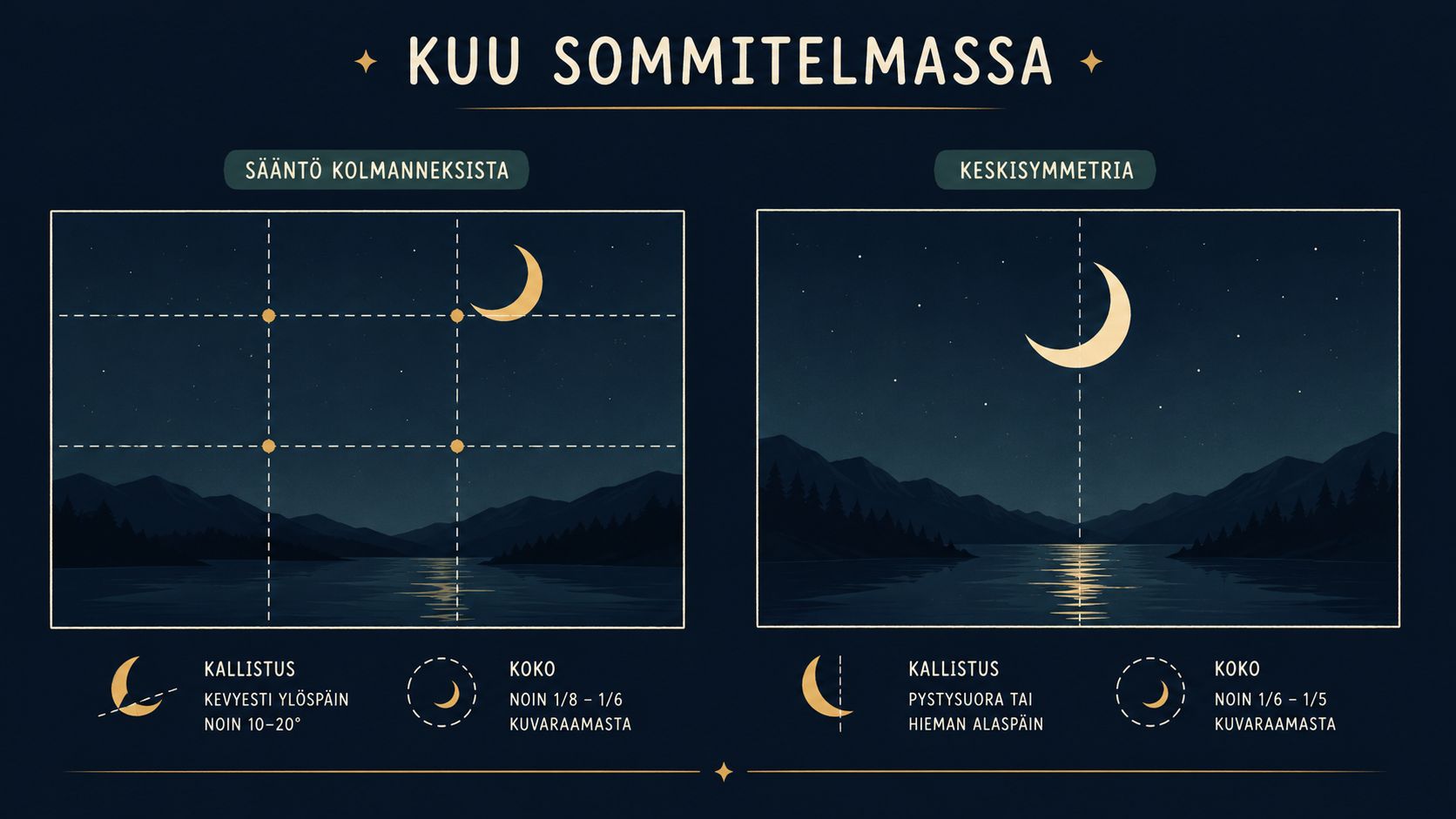
Place the moon before you decorate it
Composition gets easier when you place the moon first and treat everything else as support.
Three layouts consistently work:
- Centered symmetry works well for ceremonial or commemorative prints.
- Upper-third placement creates more breathing room for text, stars, or botanical forms below.
- Off-center balance feels more editorial and usually suits modern interiors better than a centered poster.
Large empty areas aren't wasted space here. They help the viewer read the crescent as luminous and isolated.
Get waxing and waning right
This is the step that generic tutorials skip. Over 75% of generic crescent moon tutorials show the orientation incorrectly for northern hemisphere viewers, which is a real problem if you're making a personalized sky print rather than a decorative symbol, as discussed by John Pratt's moon art accuracy guide.
The practical workflow is simple:
- Start with the date and location. Don't draw from memory.
- Confirm whether the moon is waxing or waning. These are not interchangeable visual moods.
- Check the viewing orientation for that place. A crescent that reads naturally in one context can look reversed in another.
- Tilt last. Designers often lock the tilt too early, then force stars and text around a moon that's already inaccurate.
A frequent mistake is drawing a “comfortable” right-facing crescent because the hand likes that motion. That habit produces posters that feel polished but astronomically off.
If the print commemorates a birth, anniversary, or memorial date, orientation isn't a flourish. It's part of the factual content.
Match the framing to the phase
A thin crescent needs space. A thicker crescent can carry more detail and tolerate a busier layout. If you crowd a slim crescent with script, star clusters, and secondary illustrations, it loses its quiet tension.
Use this as a quick check:
| Crescent type | Better composition choice |
|---|---|
| Thin waxing or waning sliver | More negative space, less text |
| Medium crescent | Balanced text and ornament |
| Thick crescent near quarter phase | Can anchor bolder layouts |
The strongest personalized posters usually look slightly restrained on screen. That's normal. Framed on a wall, restraint reads as confidence.
Designing Crescent Moon Art in the Online Editor
A browser editor is where a moon print usually succeeds or fails. On screen, almost any crescent looks convincing for a few minutes. The problems show up when you start placing text, checking the phase against the date, and rotating the moon to match how it would appear for that person and place.
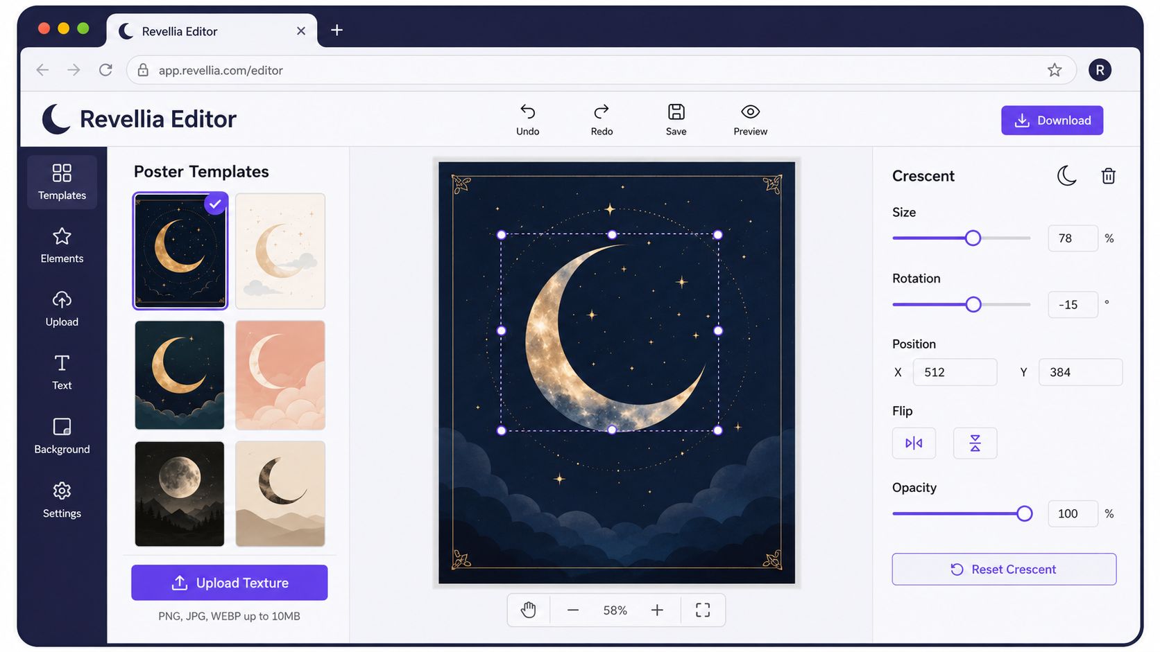
Set the factual structure first
The editor works best if you treat the moon as content, not decoration. Before adjusting textures or colors, lock in the parts that affect accuracy and layout. That means the date-based phase, the orientation, the crop, and the space needed for text.
If you're using a dedicated custom moon phase print editor, preview the date-driven layout before styling anything. It saves time because you can judge the phase shape and text spacing in the same view.
Here's the order I use:
- Choose the final format first. Portrait, square, and horizontally-oriented formats each change how much empty space the crescent needs.
- Place the moon before decorative elements. The crescent should establish the visual weight of the poster.
- Rotate only after confirming orientation. A personalized print can look polished and still be astronomically wrong if the crescent is tilted for aesthetics instead of observation.
- Reserve the text block early. Names, dates, and coordinates often force the moon off-center if you wait too long.
- Add stars and textures last. They should support the moon, not compete with it.
A thin crescent is easy to overpower. Designers run into trouble when they judge balance from a zoomed-in canvas instead of the full poster view.
Build layers in a strict order
Layer discipline matters more than extra effects. A clean poster usually has fewer decisions, not more.
Use this stack:
- Background
- Moon shape
- Secondary celestial details
- Typography
- Texture or grain
That order prevents a common mistake. Decorative stars get scattered first, then the text and crescent are forced into the remaining gaps. The result feels busy and slightly accidental.
Keep one area sharp. If the moon glows, the typography should stay crisp. If the background carries grain, don't add another heavy texture over the crescent.
Draw the crescent with print in mind
In vector work, the crescent needs clean geometry. The outer edge reads best as a circular arc. The inner shadow boundary should read as an ellipse, not a second circle. On a small screen, the shortcut often slips by. At poster size, the inner curve can look stiff and flat.
A practical build method is simple:
- Draw the outer circle at the size you need
- Add an inner ellipse with the same overall height
- Narrow that ellipse to match the chosen phase
- Merge or mask the shapes cleanly
- Inspect the inner bright edge at high zoom for jagged aliasing
The exact width changes with phase, so I adjust by eye after checking the date reference. What matters is keeping the inner boundary believable and smooth.
A quick workflow demo helps when you're testing these adjustments inside an editor:
Editor choices that usually hold up in print
The strongest online-editor layouts tend to follow the same patterns.
| Works well | Usually causes trouble |
|---|---|
| One dominant crescent with clear breathing room | Several equal focal points around a small moon |
| Phase shape matched to the actual date | Generic stock crescent dropped in for mood |
| Orientation checked before final rotation | Decorative tilt that reverses or misstates the moon |
| Restrained palette with one bright accent | Multiple glow effects and competing colors |
| Clean vector edges and readable type | Soft effects piled onto every layer |
If a design only looks good after lots of sparkles, haze, and glow, the base composition still needs work. The editor makes it easy to keep adding. Good poster-making usually means stopping earlier.
Choosing Print Materials and Poster Sizes
A crescent moon poster usually passes the screen test before it passes the wall test. The failures show up fast in print. Glare across a dark sky, muddy shadow detail, or a crescent that looked graceful at laptop size but feels thin and underpowered from six feet away.
Finish matters more than people expect
For crescent moon art, matte paper is usually the safer print surface. It holds dark backgrounds without hot reflections and keeps the lit edge of the crescent readable behind glass. Semi-gloss has a place if the piece relies on saturated blues, nebula textures, or painterly color shifts, but it asks more from the room. Window light, ceiling spots, and lamps can all start competing with the moon.
If you want a plain-language breakdown of how different matte stocks behave, this guide to matte paper for posters covers the basics well.
I only recommend sheen when the lighting is predictable.
Size and geometry have to agree
Large prints expose every shortcut. A crescent that feels convincing at a small proof can start looking wrong once you scale it to 24×36 or larger, especially along the inner shadow boundary. If that inner edge is clumsy, too circular, or softened by low-resolution export, the print loses the astronomical credibility that makes a personalized moon phase piece feel personal in the first place.
Orientation matters here too. A waxing crescent printed for a northern-hemisphere event can look subtly off if the final poster is rotated for composition and nobody checks the sky reference again. That mistake gets harder to ignore at larger sizes because the moon becomes the main subject, not a small decorative accent.
Print Material Comparison
| Paper Type | Finish | Weight (gsm) | Ideal Poster Size |
|---|---|---|---|
| Museum matte | Non-reflective | 200 | A2, 24×36 inches |
| Semi-gloss poster paper | Light sheen | 200 | Mid-size statement prints |
| Textured archival stock | Tactile matte | 230 | Smaller art-focused formats |
A few pairings hold up reliably in real rooms:
- Fine line crescent artwork works best on museum matte, where glare does not break the contour or hide subtle phase detail.
- Watercolor celestial scenes can handle a slight sheen, but only in spaces with controlled light.
- Text-heavy commemorative posters print more comfortably on matte or textured stock because names, dates, and coordinates stay easier to read.
Size should follow viewing distance and subject detail. Smaller formats suit close viewing, such as a bedside frame or shelf display. Over a sofa or bed, the moon needs enough diameter to read clearly from across the room, and the phase still needs to be oriented correctly for the date and location being commemorated.
Framing and Display Ideas
Frame choice decides whether crescent moon art reads contemporary, romantic, or ceremonial. The print doesn't change. The context does.
Frames that support the moon instead of competing with it
Black metal works well when the poster is graphic and minimal. Natural oak softens botanical or nursery-focused designs. White frames can work, but only when the poster has enough contrast to keep the edges from disappearing into the wall.
Floating frames are usually less effective for paper moon prints than standard frames with a clean border or mat. The moon benefits from containment.
Matting and spacing
A mat gives a crescent room to breathe, especially in thinner phases. Dark prints often look stronger with an off-white mat rather than a bright white one. The warmer edge keeps the piece from feeling clinical.
For larger arrangements, don't hang multiple celestial prints at random heights. Build a visual line across the group. If you need layout direction for oversized walls, these wall art ideas for a large wall are a useful starting point.
A moon poster wants calm around it. Tight clustering can strip away the atmosphere that made you choose the piece in the first place.
Best room pairings
| Room style | Better frame choice |
|---|---|
| Minimal modern | Thin black or brushed metal |
| Warm natural interior | Oak or walnut |
| Nursery or soft romantic decor | Light wood or muted painted frame |
If the piece marks a personal date, hang it where people can read it. Entryways and bedroom walls usually work better than crowded gallery walls in transitional spaces.
Conclusion and Gifting Ideas
The difference between ordinary crescent moon art and a print people keep for years comes down to a handful of decisions. Choose a style with discipline. Keep the composition calm. Make the phase and orientation match the sky. Print it on a surface that won't fight the artwork once it's framed.
That accuracy matters more now because buyers are looking for it. Searches for accurate moon phase prints tied to personal milestones rose 40% in 2024–2025, which reflects growing demand for waxing and waning crescent depictions that match meaningful dates, as noted in the crescent moon phase overview.
For gifts, the strongest pairings are the obvious ones done carefully. A waxing crescent can suit an anniversary or a new chapter. A birth-date moon print works when the orientation is verified. A housewarming piece feels more thoughtful when the poster reflects a real night sky rather than a decorative guess.
The poster doesn't need to be elaborate. It needs to be right.
If you want to turn a meaningful date into a personalized wall piece, Revellia offers custom poster tools for moon phases and other date-based prints, with browser-based editing and print production designed for finished display pieces.