You've probably done the hard parts already. The table is chosen, the chairs work, the pendant looks good, and the rug pulls the room together. But the room still feels unfinished because the walls are doing almost nothing.
That's common in dining rooms. People treat wall decor like the last five-minute decision, then wonder why the space feels flat once everyone sits down. In practice, the wall is what gives the room a point of view. It sets the tone before dinner starts, carries the eye upward, and often becomes the first thing guests respond to.
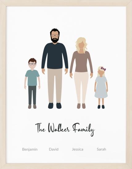
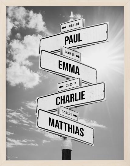
The strongest contemporary dining rooms don't just look styled. They feel inhabited. A single oversized artwork can do that. A mural can do that. So can a personal piece tied to a place, a date, or a memory. Even one meaningful print can shift a room from “nicely furnished” to memorable. If you also style with greenery, architectural plants can help soften modern lines, and this guide to large cactus types is useful for understanding which sculptural forms suit cleaner interiors.
Table of Contents
- From Blank Wall to Beautiful Focal Point
- Choosing Your Art Scale and Layout
- Mixing Personalized Prints with Contemporary Art
- Pro-Level Placement and Hanging Techniques
- The Finishing Touches Lighting and Framing
- Smart Shopping for Custom Wall Decor
From Blank Wall to Beautiful Focal Point
A dining room usually starts to look “almost done” long before it feels finished. The furniture handles function, but the wall decides whether the room feels calm, dramatic, warm, or forgettable. That's why contemporary wall decor for dining room design deserves more attention than it usually gets.
I see the same issue often. Homeowners buy safe, undersized art because they're afraid of getting scale wrong. The result is a well-furnished room with a weak center. The wall looks like an afterthought, and the dining area never quite develops its own identity.
The fix is rarely more stuff. It's better decisions. One confident focal point can change the room faster than several small accessories spread across shelves and corners.
What contemporary really means in a dining room
Contemporary style isn't about making a room feel stripped down. It's about editing. Lines are cleaner, but the room should still feel layered and lived in.
In a dining room, that usually means you start with a restrained base. Think simple chair profiles, a table with visual weight, and finishes that feel current rather than ornate. Then you add one or two strong moves on the wall.
A contemporary room feels intentional, not sparse. If every piece has a reason to be there, the room will read as modern even when it includes older or sentimental elements.
For 2026 projections, designers are leaning toward murals and large-scale statement art rather than fussy arrangements, with a move toward warmth and bold personality instead of cold minimalism, as noted by House Beautiful's 2026 dining room trend report.
Why texture matters more than decoration
The biggest misconception about contemporary dining rooms is that they need to stay visually quiet. What they need is controlled contrast. A matte wall, wood grain, linen drapery, a metal light fixture, or reflective glass can keep the room from feeling flat.
That's one reason mirrors and glass details work so well in dining spaces. They bounce light, sharpen edges, and add a polished layer without visual clutter. If you're considering reflective surfaces as part of the wall plan, it helps to explore specialty glass options so you can compare finishes and decide whether the room needs softness, shine, or a bit of both.
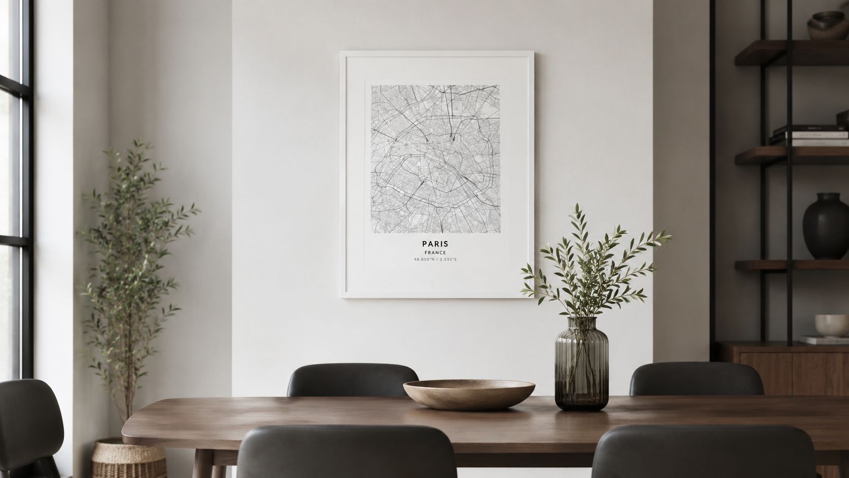
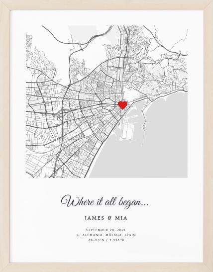
A personalized piece can sit comfortably inside this aesthetic too. A Personalized city map works when the typography, palette, and framing are handled with the same restraint as the rest of the room.
Choosing Your Art Scale and Layout
Most dining room wall problems aren't style problems. They're scale problems. Good art looks wrong when it's too small, too scattered, or floating without any relationship to the table.
For contemporary rooms, scale has become even more important because the look depends on fewer, stronger decisions. According to ElephantStock's dining room wall guide, art should occupy about 60% to 75% of the available empty wall space, and current design direction favors single impactful pieces over cluttered gallery walls.
The size rules that keep art from looking timid
Start by measuring the empty wall area, not the full wall if a buffet, molding, or other architectural elements cut into it. The target is a piece or arrangement that covers enough visual ground to anchor the room.
A second check matters just as much. For art placed in relation to the dining table, the artwork should span 50% to 75% of the table's horizontal length, according to Mosaics by Marc. That ratio creates cohesion. Too narrow, and the art feels incidental. Too wide, and it starts pressing on the furniture visually.
If there's no table directly beneath the feature wall, that same source recommends a single large-format piece of 40 inches or more to give the wall enough mass.
Statement piece or gallery wall
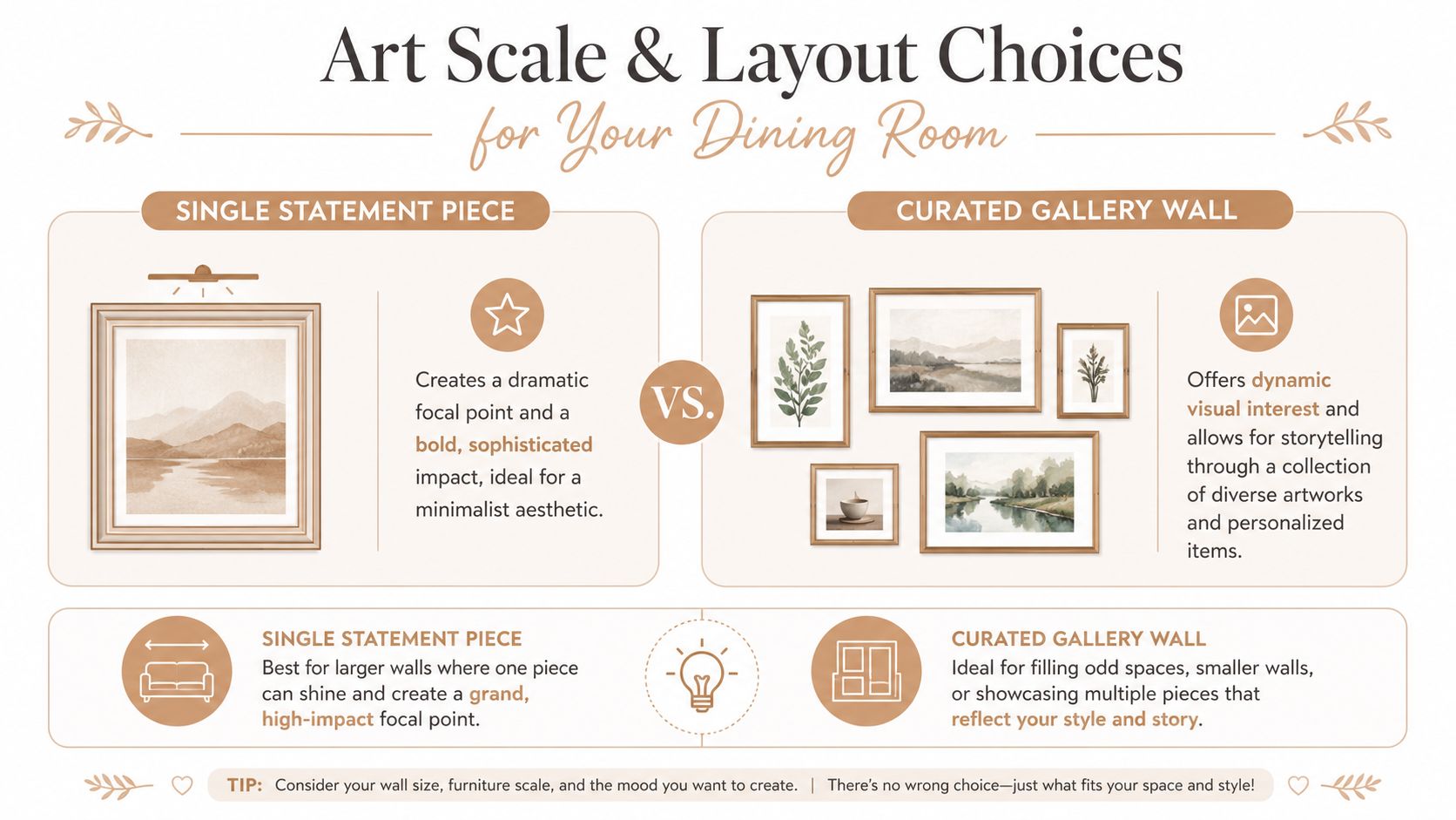
A gallery wall isn't wrong. It's just harder to do well in a dining room because the room already contains strong horizontal lines from the table, sideboard, and lighting. A cluster of smaller frames can start to feel busy fast.
A single statement piece works better when you want calm, drama, or a cleaner architectural look. A gallery wall works better when you have a genuine collection, an awkward wall shape, or a story to tell through multiple pieces.
| Factor | Single Statement Piece | Gallery Wall |
|---|---|---|
| Visual effect | Bold, calm, grounded | Layered, varied, expressive |
| Best use | Large uninterrupted wall | Narrow zones or irregular spaces |
| Styling difficulty | Lower | Higher |
| Contemporary feel | Stronger in most dining rooms | Works if tightly edited |
| Risk | Choosing art that's too small | Looking cluttered or disconnected |
A few practical trade-offs matter here:
- Choose one large piece if you want the room to feel more settled and architectural.
- Choose a gallery wall if the pieces are related by frame style, palette, or meaning.
- Avoid mixed messages. Don't pair a minimalist room with a random assortment of tiny, unrelated prints.
- Use personal pieces carefully. One meaningful item can refine the room. Too many can make it feel more like a hallway memory wall than a dining space.
Practical rule: If you hesitate between two sizes, the larger one is usually the better choice in a dining room.
A personal print can be part of either layout. For example, a Personalized birth poster can work in a smaller secondary dining nook, but in a formal dining room it usually looks strongest when paired with bolder pieces rather than standing alone without enough visual weight.
Mixing Personalized Prints with Contemporary Art
The most interesting dining rooms don't just display taste. They reveal something about the people who gather there. That's where personalized art has an edge over generic abstract prints.
Dining rooms are social spaces. People pause, look around, and ask questions. A piece tied to an anniversary, a city, a trip, or the place two people met does something a neutral canvas often can't. It starts a conversation without trying too hard.
Why personal art works especially well in dining rooms
A lot of decor advice stays focused on style categories. Abstract. Nature scenes. Black and white photography. That approach is useful, but incomplete. The dining room isn't just a visual zone. It's a ritual space tied to celebration, family habits, and memory.
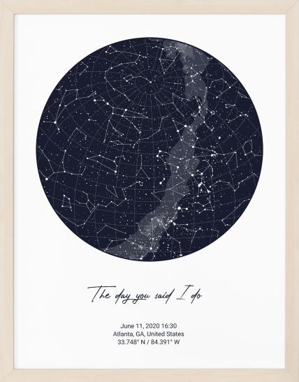
As Living Spaces notes in its dining room art ideas, trends often emphasize bold design while missing the chance to make the wall part of the dining experience itself. Personalized art, including star maps or location-based prints linked to a meaningful memory, can turn the wall into an experiential element that deepens conversation during shared meals.
That's why custom work often lands so well here. A star map of a wedding night, a city print from the place you got engaged, or a location piece tied to a major move gives the room emotional weight. Guests may not know the story immediately, but they sense that the art belongs to the home.
How to keep meaningful pieces looking refined
The concern I hear most is that personal art will look overly sentimental or out of step with a contemporary room. That happens when the piece is styled in isolation. It doesn't happen when the room gives it a framework.
Use these design controls to keep the result polished:
- Unify the frames. If you're mixing a custom map with abstract art or photography, matching frame finishes bring order fast.
- Edit the palette. Pull one or two room colors into the print selection so the personal piece feels integrated.
- Let one piece carry the story. Not every frame needs a backstory. One meaningful print often has more impact than several.
- Balance emotion with restraint. If the art has text, coordinates, or dates, pair it with quieter neighboring pieces.
A strong pairing might look like this: a personalized location print in the center, flanked by one abstract piece and one minimal photograph. The room keeps its contemporary discipline, but the wall gains depth.
The best personalized decor doesn't announce itself as personalized. It reads first as good design, then reveals a story when someone looks closer.
Pro-Level Placement and Hanging Techniques
Even beautiful art can look wrong when it's hung badly. In dining rooms, placement matters more than people expect because the room is experienced both standing and seated.
The eye line is lower during a meal. That changes how the art should sit on the wall and why common mistakes, especially hanging too high, are so noticeable.
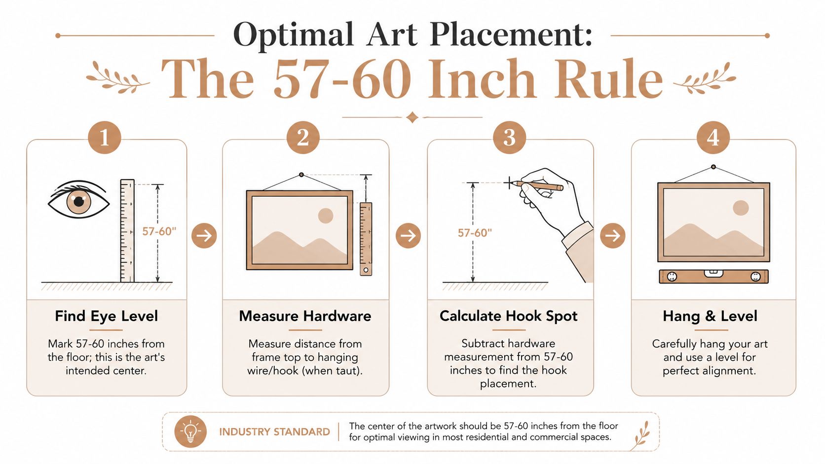
The measurements professionals rely on
The benchmark is straightforward. Center the artwork at 57 to 60 inches from the floor for comfortable viewing, and when hanging above furniture like a buffet, keep 6 to 8 inches between the furniture top and the artwork's bottom edge, according to Mixtiles' dining room hanging guide.
Those numbers solve two common problems. Art hung too high feels disconnected from the room. Art dropped too low can crowd a sideboard or feel pinched by chair backs and tabletop sightlines.
For a quick visual walkthrough, this video gives a useful demonstration of clean picture placement in practice.
A cleaner way to plan before making holes
The easiest professional trick is paper templating. It saves the wall and helps you judge spacing before anything is permanent.
- Cut paper to the size of each frame. Painter's paper, kraft paper, or taped sheets work fine.
- Mark the frame center and hardware position. Don't guess. Measure it.
- Tape the template to the wall. Step back from the doorway and from the table.
- Check alignment with furniture. The art should relate to the buffet, table, or wall width, not float independently.
- Only then place hooks. Many hanging projects falter at this stage; people often skip the test view.
If you're hanging a group, start with the center piece and build outward. If you're hanging a single large work, mark the centerline of the wall first so the composition doesn't drift slightly left or right.
The Finishing Touches Lighting and Framing
Framing and lighting decide whether wall decor feels integrated or accidental. Good art in a weak frame under poor light will still look unfinished. Average art, framed well and lit properly, often looks far more convincing.
Lighting that makes art feel intentional
Dining rooms benefit from layered light. The chandelier handles the table, but the wall often needs its own attention. A picture light, directional ceiling light, or a pair of sconces can make artwork feel anchored and important.
Light also changes what the art contributes. Texture becomes more visible. Darker palettes gain depth. Glass and metallic accents start working harder. If you're deciding where sconces belong or how they should support art instead of fighting it, these interior lighting tips are a helpful reference.
Frames that support the room instead of distracting from it
Default black frames are popular because they're easy, not because they're always right. Contemporary dining rooms often look better when the frame echoes another finish already in the space.
A few pairings work consistently well:
- Oak or walnut frames with wood tables, warm flooring, or rooms that need softness.
- Slim metal frames with stone, glass, or more architectural furnishings.
- Wide mats when the artwork has detail and needs breathing room.
- No mat or float mount when the goal is a sharper, more minimal presentation.
Frame choice should connect the artwork to the room's materials. If the frame feels unrelated to everything else, the piece will always look slightly imported.
If you use personalized prints, framing becomes even more important. It's what turns a meaningful object into part of the design language of the room.
Smart Shopping for Custom Wall Decor
Buying custom art online is easier than it used to be, but it's still worth slowing down before you order. The strongest result usually comes from matching the product to the room, not from choosing the most emotional design first.
What to check before you order
Start with the basics of usability and material quality. A custom print provider should make it easy to preview the layout, adjust text accurately, and understand what the final composition will look like before production.
Look for these practical signals:
- A live editor or preview tool so spacing, typography, and placement are visible before checkout.
- Clear material information such as museum-quality matte paper if you want a softer, less reflective finish.
- Style range that fits your room rather than forcing your room to fit the template.
- Accurate location and date inputs when the piece is tied to a real place or event.
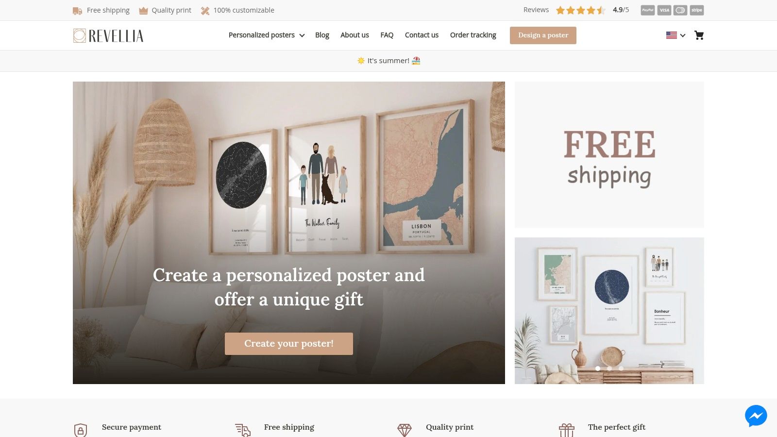
One option in this category is Revellia, which offers customizable posters such as maps and celestial prints through an in-browser editor and produces them on museum-quality matte paper.
Why production method matters
Custom decor isn't just about aesthetics anymore. Production logistics affect both sustainability and practicality.
According to the verified production data summarized in this YouTube reference on localized on-demand printing, local-partner production can reduce transport emissions by up to 67% and save an average of 3,445 km in shipping distance per order. For homeowners trying to make more thoughtful decor choices, that's a meaningful trade-off to consider.
Print-to-order production also avoids the common problem of mass-produced art sitting in storage or moving through long shipping routes before it ever reaches your wall. If you care about lower-waste purchasing, this model makes more sense than buying generic framed art that has already traveled extensively.
The best custom purchase is one that fits the room, carries meaning, and arrives in a format worth framing properly for the long term.
If you want dining room wall decor that feels current without feeling generic, personalized prints are worth considering. Revellia lets you create custom posters tied to a place, date, or memory, which makes it a practical option when you want the wall to tell a story instead of filling space.