You're standing in the living room with a print you love, a tape measure in one hand, and no clear answer to the same annoying question: will this look good on the wall, or just in the product preview? That's the problem with personalized wall art for couples. The gift part is easy. The design part is what makes the difference between something that gets hung and something that gets leaned behind a plant for six months.
Table of Contents
- Why Personalized Wall Art for Couples Starts With the Wall, Not the Catalog
- Matching the Format to the Moment You Want to Capture
- Sizing and Framing for the Wall Where It Will Actually Hang
- Designing the Print in an Online Editor Without Costly Mistakes
- Occasion Ideas That Actually Land in Real Homes
- Styling, Color, and Display Choices That Make It Look Intentional
- Pre-Checkout Checklist and Long-Term Care
Why Personalized Wall Art for Couples Starts With the Wall, Not the Catalog
Most couples shop backward. They scroll until they see a pretty print, get attached to it, then try to force their wall to cooperate. That's how you end up with art that's too small above a sofa, too busy over a bed, or too precious to commit to because it never quite fits the room.
Start with four decisions, in this order. First, pick the wall. Second, decide the moment you want the piece to carry. Third, choose the format family that matches that moment. Fourth, set a budget before you open the editor so you don't fall in love with upgrades you don't need.
That order matters because couple art isn't just sentiment, it's layout. A print can celebrate an anniversary, but if it doesn't belong on the wall, it never becomes part of the home. And a home is where this category earns its keep.
Practical rule: If you can't name the wall first, you're shopping for a gift, not designing décor.
One useful way to think about personalized wall art for couples is this, design solves the placement problem, gifting solves the meaning problem. Get the placement right and the meaning lasts longer because the piece stays visible.
If you want a shortcut, jump to the section that matches your biggest question. If you already know the moment but not the format, move to the format comparison. If you know what you want, but not how to size it, go straight to the framing section. If you're worried about proofing, the editor and checkout section will save you from expensive mistakes.
Matching the Format to the Moment You Want to Capture
Choose the format from the memory first. The right piece should make the story clearer the second someone sees it, not force them to decode what it means. If the moment is strong but the format is wrong, the print will feel clever instead of personal.
The main formats, with honest verdicts
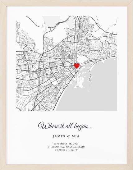
Location-based maps work best for the place that changed the relationship, first meet, first kiss, proposal, move-in day. They need a specific place and look strongest when the location matters more than the date. They fall flat when the map is chosen just because city art is popular, because the result can feel generic if the place has no emotional weight. For a first-meet anniversary, a map like the one in this where-we-met map gift page fits the brief cleanly.
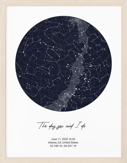
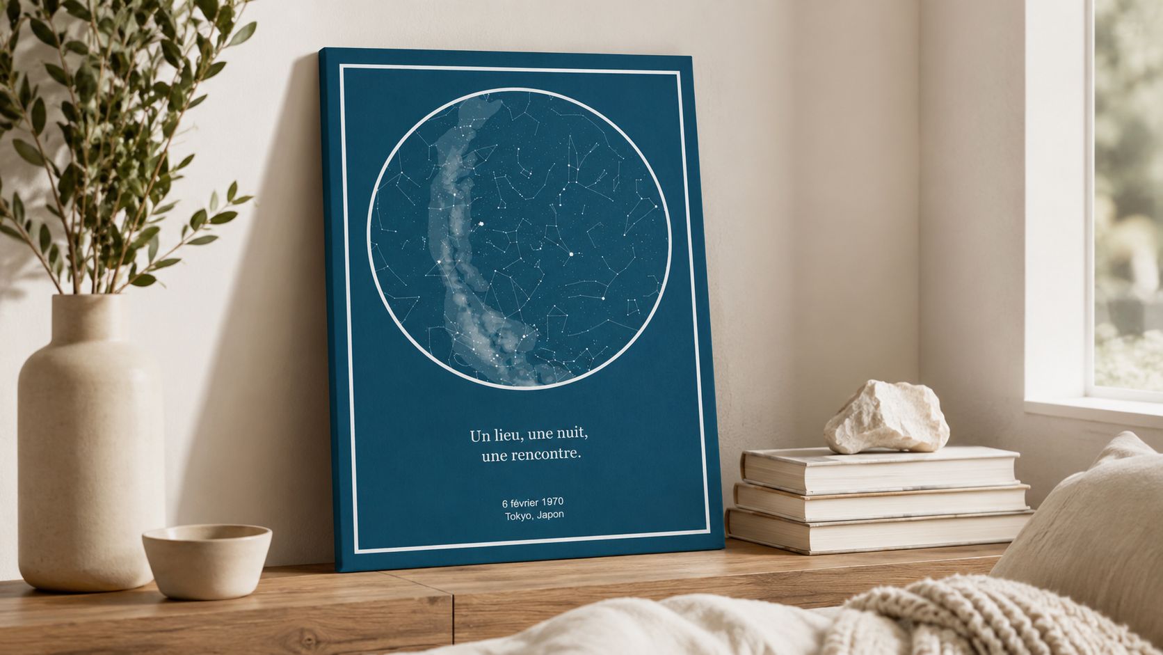
Date-based star maps and moon phases work best for a single night that matters, especially weddings, engagements, and anniversary dates. They need the exact date, and sometimes the exact time if you want the celestial detail to feel grounded. They fall flat when the date is uncertain or when the couple wants the symbolism but does not care about literal accuracy.
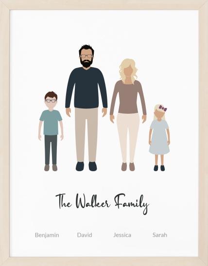
Illustrated and cartoon portraits are the right call when the photo is part of the charm, long-distance partners, playful couples, family gifts, or anyone who wants the piece to feel warm instead of formal. They need decent source photos and a willingness to commit to the style. They fall flat if you want a quiet, architectural look, because the illustration style can dominate the wall.
Typographic or definition prints work best for inside jokes, shared phrases, names, and milestone captions. They need very little visual material, which makes them easy to customize. They fall flat when the message is too long or too private to mean anything to anyone else in the room.
If you want a concrete example, a Personalized star map is a star map poster that recreates the night sky for a special moment. That makes it a strong fit when the moment itself matters more than the surrounding details.
| Format | Best for | What you need |
|---|---|---|
| Location map | First meet, proposal, move-in | City, address, or meaningful place |
| Star map or moon phase | Wedding night, anniversary date, big moment | Exact date, sometimes exact time and place |
| Illustrated portrait | Playful couple gifts, long-distance, family keepsakes | Good photos or clear character details |
| Typography or definition print | Names, dates, phrases, inside jokes | Short text that still reads from the wall |
A quick way to decide is simple. If the story is about where, choose a map. If it is about when, choose a celestial print. If it is about who you are together, choose an illustrated portrait or a text-led piece.
Sizing and Framing for the Wall Where It Will Actually Hang
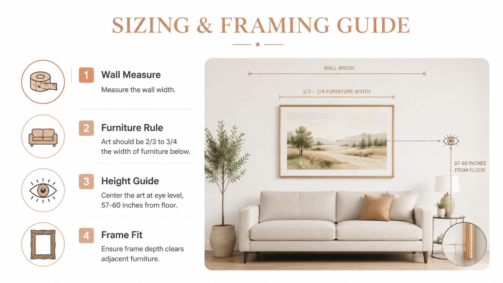
The wall decides the size, not the product page. A beautiful print can still look wrong if it floats in too much empty space or crowds the furniture below it. The easiest starting point is simple, the artwork should be roughly two-thirds to three-quarters of the width of the furniture beneath it, whether that's a sofa, bed, or console. The center of the art should sit around 57 to 60 inches from the floor when it's being viewed at eye level, which keeps the piece from feeling too high or dropped.
Where the rule changes by room
Above a sofa, go wider than your instincts tell you. Above a bed, the print usually needs to feel calm and centered, not tiny and precious. In a hallway, a vertical piece or a narrow pair works better because the wall itself is doing less visual work.
A console table can handle a slightly smaller piece if the object below it already has presence. A bedroom wall often needs less visual noise, so a framed print or a single canvas usually beats a crowded cluster. And in a narrow passage, leaving breathing room matters more than forcing scale.
Frame choice changes the mood fast. Thin black frames read modern and crisp. Natural wood softens the piece and fits warm or Scandinavian rooms. A gallery-style frame belongs when you want the print to feel collected, not casual.
If the artwork is smaller than the wall really wants, float it inside a larger mat. That makes the piece feel intentional instead of underfed. This is the move that saves smaller personalized prints from looking accidental.
For a deeper measurement pass, use the guidance in the poster sizing guide before you order.
Measure the wall, then the furniture, then the print. That order prevents most sizing regrets.
Use this before checkout:
- Measure the width: Compare the wall or furniture width to the art size.
- Check eye level: Keep the center line around normal viewing height.
- Judge the frame depth: Make sure it clears nearby furniture or trim.
- Leave margin: Don't let the print crowd the edges of the wall.
Designing the Print in an Online Editor Without Costly Mistakes
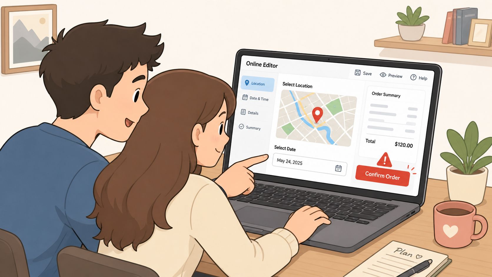
The editor is where good ideas get ruined by lazy proofing. Enter names, dates, places, and captions exactly the way you want them to appear on the wall, because this is not the place for casual typing. A typo on screen is annoying. A typo after printing is expensive.
Use the live preview like a skeptic. Check line breaks, crop placement, and the amount of empty space around the text. If the custom wording runs long, shorten it. Long messages shrink fast, and tiny text turns a romantic print into something nobody can read from across the room.
What to verify before you click buy
- Names and dates: Spell everything exactly once, then read it again.
- Crop and zoom: Make sure key faces, landmarks, or borders aren't clipped.
- Text length: Keep phrases short enough to stay legible at wall distance.
- Preview balance: Confirm the layout still works when you imagine it in the room.
Use mockups or AR previews if the store offers them. They're not just gimmicks. They help you catch the mismatch between a laptop screen and a real wall. That's especially useful for a couple print that needs to sit above furniture and feel centered in context.
If you're choosing between finish options, I'd lean toward museum-grade matte paper when you want a cleaner, more art-like look, and FSC-certified wood framing when the room needs warmth and structure. On-demand printing also makes sense here because the piece is produced after you finalize the details instead of sitting in a warehouse waiting to be customized. In Revellia's model, delivery is typically within 3 to 7 business days and orders are tracked, which is useful when you're planning around an anniversary or move-in date. Those details sit in the same workflow as the editor, not after it.
There's a practical reason I like stores that keep the process tight. If the editor, proof, and checkout are all in one place, you're less likely to make a rushed decision on shipping or framing. Revellia's custom map print sits in that category, where the location detail is the main event and the proofing step matters just as much as the visual style.
Occasion Ideas That Actually Land in Real Homes
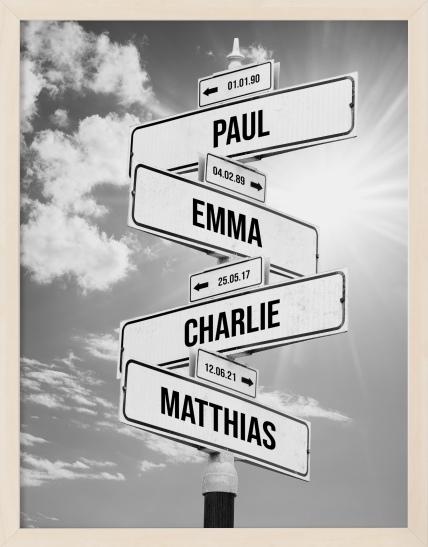
Anniversaries are the easiest place to get this right because the moment is already specific. A wedding-night star map, a moon-phase chart for the date you married, or a street-sign-style print with both names and years all work when the wall is in a bedroom, hallway, or a more private space. The best anniversary gift ideas in Canada are often the ones that turn a date into décor, and anniversary gift ideas in Canada can be a useful starting point if you're comparing broader gift options before narrowing to wall art.
Four scenarios, four clean directions
Anniversaries: Choose a celestial print for the wedding date or a text-led piece if the couple already has a sentimental wall. This tends to land well when the room is calm and the print can be a quiet focal point.
Weddings and engagements: Go with a “where we met” or “where we got engaged” map in colors that echo the couple's home, not the registry theme. These pieces usually work best in shared spaces because they feel established rather than overly romantic.
New homes: Use a neighborhood map or city map tied to the move-in address. That choice makes the piece feel like part of the house story, which is exactly what housewarming décor should do.
Long-distance relationships: Use paired star maps or moon charts from the same moment but different places. That idea works because each partner gets the same emotional reference point, even if their coordinates differ.
A good anniversary print usually gets noticed immediately on a gallery wall. A weaker one gets passed over because it looks like a generic gift with a name on it. The difference is usually the moment, not the price.
The strongest couple prints don't just say “this was special.” They tell you why it mattered the second you see them.
Pick the scenario first, then the format, then the colors. That sequence keeps the piece from drifting into the generic “custom gift” zone.
Styling, Color, and Display Choices That Make It Look Intentional
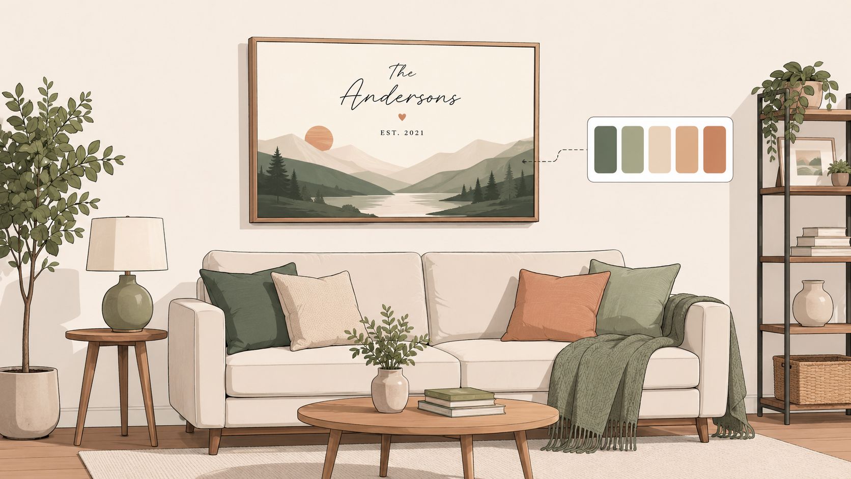
Big isn't automatically better. A huge sentimental print that fights the room looks more awkward than a smaller one that fits the palette and spacing. The goal is not to dominate the wall. The goal is to make the wall feel finished.
Don't try to match every color in the room. Pick the dominant tone, then pull in two secondary colors that appear elsewhere in the décor. That gives the print enough connection to belong without turning it into a copy of the sofa cushions.
If the room changes before the print arrives, don't panic and rework everything. Reframe the piece against the new surroundings. A clean paper print can feel sharper in a newly modern room, while a canvas can soften a space that's become too sleek. For readers who like a more layered look, The Sofa Cover Crafter's boho decor guide for Australian homes is useful background on how wall art can sit inside a broader room style without taking over.
Display choices that stop the wall from feeling cluttered
A single statement print can sit above a sofa or bed on its own if the scale is right. Two smaller companions can balance it if the wall is wide and the room already uses symmetry. A sentimental print can also slip into a gallery wall, but it needs visual breathing room so it doesn't get swallowed by everything around it.
Lighting matters more than people think. A slim picture light can pull a couple's print forward at night and make it feel deliberate instead of lost in ambient light. That works especially well in dining areas, hallways, or bedrooms where the wall needs one clear focal point.
Privacy and emotional nuance matter too. Not every couple wants exact coordinates, a full date, or a private place name on display. Sometimes a first date, a graduation, or a symbolic location says enough without exposing more than you want on the wall.
If you want the print to feel grown-up, keep the message short and let the room do some of the storytelling. That approach looks calmer, and calm almost always reads as intentional.
Pre-Checkout Checklist and Long-Term Care
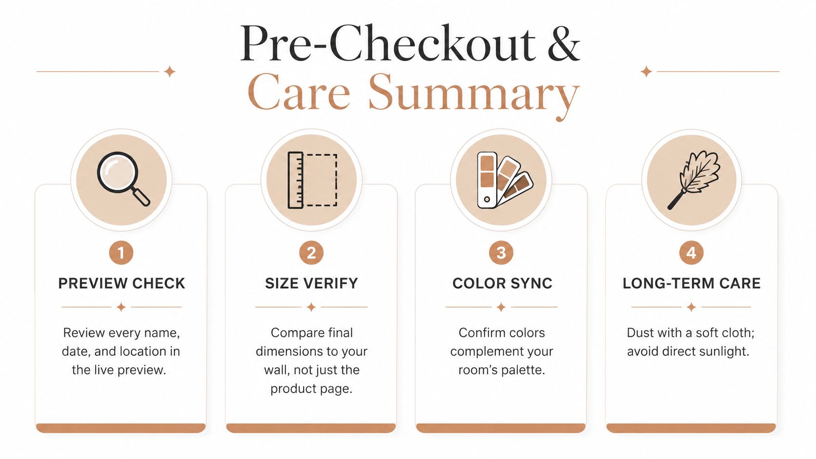
Before you buy, run the same checklist every time. It's boring, and it saves you from the mistakes that make custom art feel like a gamble.
Pre-checkout checklist
- Preview every detail: Read the names, dates, and locations in the live preview.
- Verify size in the room: Compare the final dimensions to the actual wall, not the screen.
- Match the frame: Make sure the frame fits the room's tone and doesn't fight nearby furniture.
- Choose the right paper: Pick archival matte paper if longevity matters to you.
- Confirm shipping: Double-check the delivery window and the shipping address before payment.
Care that keeps the print looking good
Keep prints out of direct sunlight whenever you can. Sunlight is the fastest way to make even a beautiful piece look tired. Use acid-free tape or proper hangers, not whatever's in the junk drawer.
Canvas prints don't belong in humid bathrooms. Framed glass is easier to maintain, just dust it with a microfiber cloth now and then. That's enough for most homes if the piece is hung in a normal living space.
If you want a quick summary for the wall art decision itself, use this table before you buy.
| Decision | What to do | Why it matters |
|---|---|---|
| Format | Match the memory to the type of print | The right format makes the story obvious |
| Size | Measure the wall and furniture first | Scale determines whether it feels intentional |
| Frame | Choose the finish that fits the room | Frame style changes the whole mood |
| Proof | Read the preview carefully | Most expensive mistakes happen here |
| Care | Hang away from sunlight and moisture | Good care keeps the piece display-worthy |
A personalized couple print works best when the print, the wall, and the moment all agree with each other. That's the difference between a nice custom gift and a piece that feels like it was made for the room from the start.
Revellia makes personalized posters and prints for couples who want the story on the wall to look as considered as the room itself. If you're ready to turn a date, place, or shared moment into something that fits your home, visit Revellia and start with the wall first.